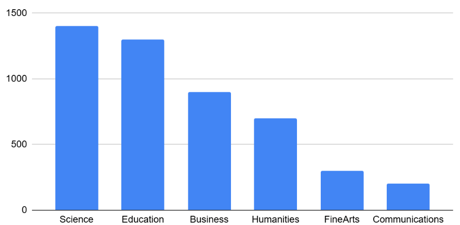
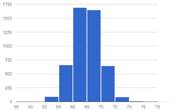
A university consists of six colleges. Each student in the university has chosen to enroll in one of these colleges. The bar chart below shows the distribution of college choice. The histogram below shows the distribution of students by height in inches.
|
|
Differences and Similarities
Respond to the prompts to complete the table below.
| Bar Chart | Histogram | |
|---|---|---|
Displays frequency: yes or no? |
||
Type of data: categorical or quantitative? |
||
Bars touch: yes or no? |
||
Bars can be reordered: yes or no? |
||
The shape of the data matters: yes or no? |
1 What are some of the ways that bar charts and histograms are alike? Summarize your conclusions from the table.
2 What are some of the ways that bar charts and histograms are different? Summarize your conclusions from the table.
Distribution of College Choice
Four different students share their conclusions about the bar graph displayed above. Only one of those conclusions is correct. Respond whether you agree or not, and then explain your stance.
Student A: "The distribution is skewed to the left."
Student B: "The distribution is skewed to the right."
Student C: "The majority of students are enrolled in the college of science."
Student D: "After science and education, there is a large drop in enrollments for the other colleges."
These materials were developed partly through support of the National Science Foundation, (awards 1042210, 1535276, 1648684, 1738598, 2031479, and 1501927).  Bootstrap by the Bootstrap Community is licensed under a Creative Commons 4.0 Unported License. This license does not grant permission to run training or professional development. Offering training or professional development with materials substantially derived from Bootstrap must be approved in writing by a Bootstrap Director. Permissions beyond the scope of this license, such as to run training, may be available by contacting contact@BootstrapWorld.org.

