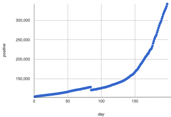
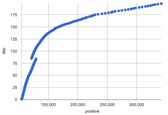
The scatter plots below were made with the same data… we just swapped the x- and y-axes.
-
The first scatter plot shows an exponential relationship: the number of Covid Infections as a function of Days
-
The second scatter plot shows a logarithmic relationship: Days as a function of Infections
| Days → Infections | Infections → Days |
|---|---|
|
|
1 What question might you answer from this graph? |
2 What question might you answer from this graph? |
| What do you Notice? | What do you Wonder? |
|---|---|
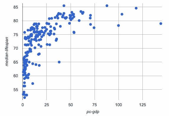
3 This third scatter plot is our current dataset. Which of the scatter plots above does it resemble?
|
Days → Infections
Infections → Days |
These materials were developed partly through support of the National Science Foundation, (awards 1042210, 1535276, 1648684, 1738598, 2031479, and 1501927).  Bootstrap by the Bootstrap Community is licensed under a Creative Commons 4.0 Unported License. This license does not grant permission to run training or professional development. Offering training or professional development with materials substantially derived from Bootstrap must be approved in writing by a Bootstrap Director. Permissions beyond the scope of this license, such as to run training, may be available by contacting contact@BootstrapWorld.org.


