Students use data visualizations like bar and pie charts to create 1- and 2-level groupings to visualize the distribution of categorical data. This lesson optionally includes Project: Make an Infographic🎨 .
Lesson Goals |
Students will be able to:
|
Student-facing Lesson Goals |
|
Materials |
|
Supplemental Materials |
|
Preparation |
|
Key Points for the Facilitator |
This lesson uses the Expanded Animals Starter File, which includes far more animals than the smaller sample represented in the animals starter file used in most of our lessons. |
Optional Project |
|
🔗Grouping by Value
Overview
Students learn one way of grouping data, showing the frequency of values in a dataset using bar and pie charts.
Launch
If you decided to launch today’s class using our Live Pyret Survey, now is the time!
When you click "Run", the What Color are your Eyes? (Starter File) builds a bar-chart and pie-chart side-by-side.
Assuming you’ve already…
-
Followed the Instructions to Set up and Link the Files
-
Shared the link you made to your class' copy of the What Color are your Eyes? (Google Form)
The data visualizations will be generated using data from your students!
And they will continue to update in real time as more of your students complete the Google Form.
Project your screen and/or publish the starter file and share a link with your students.
Facilitate a discussion about this new-to-them Pyret Data Visualization!
-
Open the Google Form Survey link I shared and submit your response.
-
Then look at the Survey Results being displayed in the new Data Visualization on the Board.
-
What do you Notice?
-
What do you Wonder?
-
Open the Expanded Animals Starter File and click "Run".
-
Then complete Part A of Frequency Tables, Bar Charts and Pie Charts, by testing the expressions
count(more-animals, "species")andbar-chart(more-animals, "species")in the Interactions Area.
-
How do the frequency table and bar chart you just made compare?
-
The height of each bar matches the frequency with which each species occurs at the shelter.
-
How does this pie chart compare to the bar chart you just made?
-
The wedges show the frequency as a percentage, whereas the bar chart shows the frequency as a count of each value. It’s easy to compare one bar to another, but harder to compare the frequency of any one bar against the whole sample. The pie chart is the opposite: it’s easy to see how a single wedge compares to the whole pie, but more difficult to see how one wedge compares to another.
Investigate
Have students complete Bar Chart — Notice and Wonder and Pie Chart — Notice and Wonder.
Turn to Bar & Pie Chart — Notice and Wonder and take two minutes to notice and wonder about the visualizations. Then compare your Notices and Wonders with your partner.
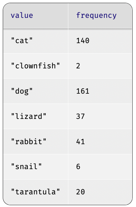
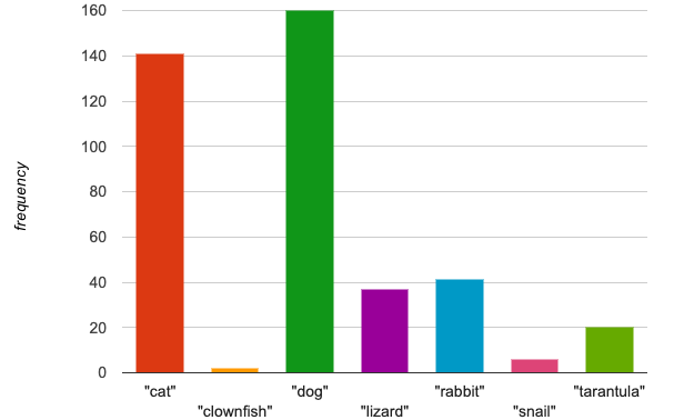
Both bar-chart and count group the data in one column by value, creating "buckets" showing the frequency of each unique value. One uses a picture, and one uses a table.
When you first build a bar chart or pie chart in pyret, they are interactive visualizations of the data. That means that you can mouse over a bar to reveal the label, as well as the number of animals in that species. We can also resize the window by dragging its borders. This allows us to experiment with the data before closing the window and generating the final, non-interactive image.
Bar charts group data by value to show frequency.
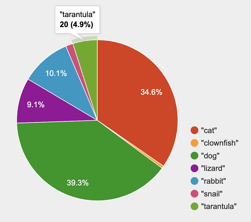 Pie charts show us the percentage of the data points that fall in each category. Hovering over a pie slice reveals the label, as well as the frequency and the percentage of the whole. In this example we see that there is 1 animal that is a snail, representing 3.1% of the population.
Pie charts group data by value to show frequency as a percentage.
If our data is based on sample data from a larger population, we can use these charts to infer the proportion of a whole population that might belong to each category. For example, the distribution of species in our shelter might help us make guesses about the distribution of species in other shelters.
While bars in some bar charts should follow some logical order (alphabetical, small-medium-large, etc), the pie slices and bars can really be placed in any order, without changing the meaning of the chart.
-
Complete Matching Bar and Pie Charts with your partner.
-
Then return to Frequency Tables, Bar Charts and Pie Charts and complete parts B & C.
-
What information is provided in bar charts that is hidden in pie charts?
-
Categories containing 0% of the data aren’t represented on a pie chart.
-
Why might it sometimes be problematic to use a pie chart, thereby hiding a category?
-
If, for example, a sector of the population is unrepresented in positions of power, it’s easier to ignore the issue if that population doesn’t get represented in the display.
-
Why isn’t it useful to group the
poundscolumn usingbar-chartorpie-chart? -
Grouping by value works well for categorical data, when lots of different data points can be sorted into a smaller number of buckets. But for quantitative data — which can have lots of different values — the number of buckets is too large to be useful.
Grouping by value works well when lots of different data points can be sorted into a smaller number of buckets.
Common Misconceptions
-
Bar charts look a lot like another kind of chart — called a "histogram" — which are actually quite different because they display quantitative data, not categorical. This lesson focuses entirely on pie- and bar charts.
-
When comparing bar charts, it is important to read the scales on the y-axes. If the scales do not match, a taller bar may not represent a larger value.
-
The percentages on pie charts will always add to 100%, so if there are 5 subgroups of a population and we’re only going to look at data from 2 of the subgroups, it wouldn’t make sense to use a pie chart to compare them!
-
Relatedly, pie charts only have a wedge for each category whose population is large enough to claim a percentage of the pie. Unlike in bar charts, empty categories will not be included in a pie chart.
Synthesize
-
How is
pie-chartsimilar tobar-chart? How is it different? When would you want to use one chart instead of another? -
They both display categorical data.
-
pie-chartdoes not display empty columns, whereasbar-chartdoes/ -
pie-chartis usually better when we care most about the ratio of the categories to each other. -
bar-chartis usually better when we are most interested in displaying the count.
-
Which visualizations do you find it easier to interpret? Why?
-
What questions about the dataset are you curious to investigate using these visualizations? }
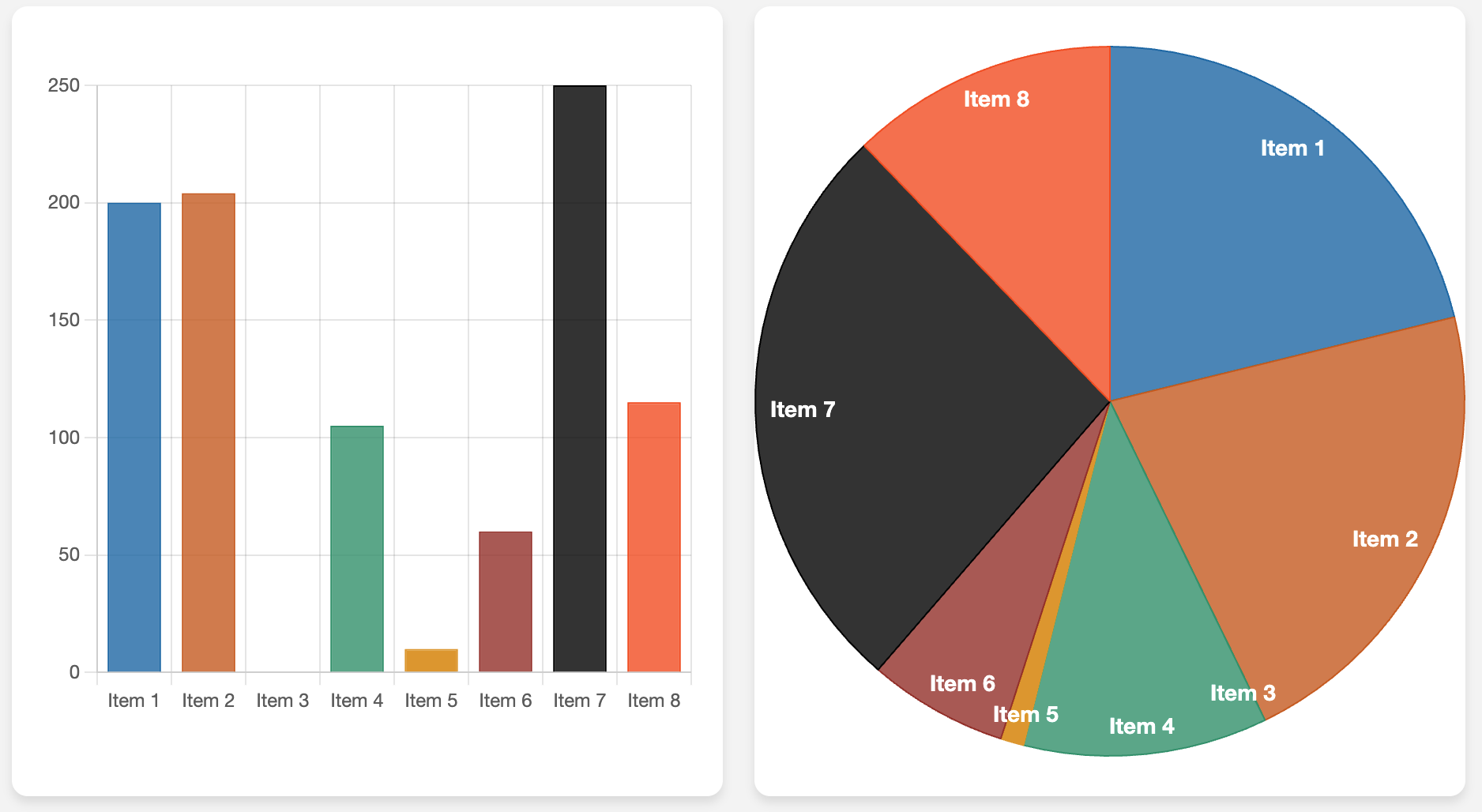
If you’re looking for more conversation starters about when to use a bar chart vs. a pie chart, you might enjoy facilitating a discussion using this teaching tool from Evan Peck, which builds side by side comparisons of the pie and bar charts that would be generated from a list summarizing the frequencies of each category.
-
What question(s) would be easier to answer from the pie chart?
-
Estimate what fraction of the dataset Item 8 represents.
-
What question(s) would be easier to answer from the bar chart?
-
Which item was most common?
-
Which items were not represented?
-
Were any of the items equally common?
Optional Extension
Sometimes we want to visualize data that is already summarized:
| Hair Color | Number of Students |
|---|---|
"Black" |
5 |
"Brown" |
13 |
"Blond" |
4 |
"Red" |
2 |
"Pink" |
1 |
In this situation, we want to use the values in the first column for the labels of our pie slices or bars, and the values in the second column for the size. We have contracts for those, too:
# pie-chart-summarized :: (Tabletable-name, Stringlabels, Stringvalues) -> Image
# bar-chart-summarized :: (Tabletable-name, Stringlabels, Stringvalues) -> Image
Open the Hair Color Starter File to try them out!
🔗Groups and Subgroups
Overview
Students learn how to create groups within groups, showing the relative frequency of one variable across values of another variable using stacked and multi bar charts.
Launch
Turn to Introducing Visualizations for Subgroups and complete Part A now.
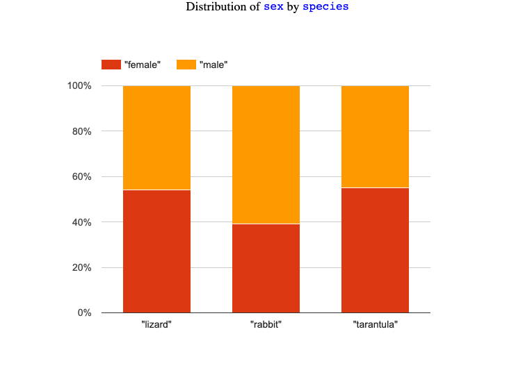
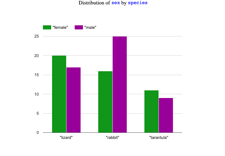
Comparing groups is great, but sometimes we want to compare sub-groups across groups. In this example, we want to compare the distribution of sexes across each species.
-
Let’s step away from the Animals Dataset for a moment to learn about some new kinds of data visualizations that would make it easier to answer questions like these by revealing the subgroups in a column. Turn to Multi Bar & Stacked Bar Charts — Notice and Wonder.
-
What do you Notice? What do you Wonder?
Investigate
Pyret has two functions that let us specify both a group and a subgroup:
# stacked-bar-chart :: (Tabletable-name, Stringgroup, Stringsubgroup) -> Image
# multi-bar-chart :: (Tabletable-name, Stringgroup, Stringsubgroup) -> Image
Complete Part B of Introducing Visualizations for Subgroups
Stacked Bar Chart |
Multi Bar Chart |
|
|
Stacked Bar Charts put the groups side by side, so it’s easy to answer which species is the "most female". But it’s more difficult to see whether there are more female dogs than male cats, because the bars don’t all start from the bottom and they’re in percentages rather than raw quantities. |
Multi Bar Charts put the subgroups side by side, so it’s easy to answer whether there are more female dogs than male cats in the shelter. But it’s a little more difficult to see which species is the "most female", because we have to estimate the relative lengths of each bar. |
Synthesize
All of the charts we’ve looked at in this lesson work with categorical data, showing us the frequency of values in one or two groups.
-
What are some of the questions you asked about the animals dataset using these visualizations? And what did you learn?
-
What kinds of questions need stacked or multi bar charts, rather than pie or bar charts?
-
What kinds of questions are better answered by stacked bar charts?
-
Questions where we are most interested in comparing the ratio of the makeup of the overarching groups.
-
What kinds of questions are better answered by multi bar charts?
-
Questions where we are most interested in comparing the count of the subgroups.
🔗Additional Exercises
-
For more practice making and interpreting these chart types in Pyret, we have a second teaching dataset for you to work with! You can have students create additional visualizations using Global Food Supply & Production Starter File.
-
For more practice without a computer, have students turn to Matching Stacked and Multi Bar Charts.
These materials were developed partly through support of the National Science Foundation, (awards 1042210, 1535276, 1648684, 1738598, 2031479, and 1501927).  Bootstrap by the Bootstrap Community is licensed under a Creative Commons 4.0 Unported License. This license does not grant permission to run training or professional development. Offering training or professional development with materials substantially derived from Bootstrap must be approved in writing by a Bootstrap Director. Permissions beyond the scope of this license, such as to run training, may be available by contacting contact@BootstrapWorld.org.

