(Using another tool? Please select it now: Pyret.)
Students compute five-number summaries from quantitative datasets, and then use those five-number summaries to create box plots.
Lesson Goals |
Students will be able to…
|
Student-facing Lesson Goals |
|
Materials |
|
🔗The Five-Number Summary
Overview
Students learn about how to use range, quartiles, and interquartile range to talk about variability.
Launch
Each of the three dot plots shown below has a median of 60.
|
|
|
-
We know that these dot plots represent datasets that have the same median, but the data definitely isn’t the same! In what ways are they different?
-
Each dot plot has a different spread and a different shape. There are different peaks, gaps, and outliers.
How do statisticians talk about what makes each sample unique?
One way to characterize the distribution of data is a five-number summary. To compute a five-number summary, we arrange the data values from least to greatest. Then, we decompose a dataset into four equal parts, separated by quartiles. This process can offer us a more nuanced idea of how the data is spread out.
Here are the specific ingredients for a 5-Number Summary:
-
Minimum: the smallest value in a dataset — it starts the first quarter
-
Q1 (lower quartile): the number that separates the first quarter of the data from the second quarter of the data
-
Q2 (Median): the middle value in a dataset
-
Q3 (upper quartile): the value that separates the third quarter of the data from the last
-
Maximum: the largest value in a dataset — it ends the fourth quarter of the data
Let’s try this out for a dataset with an even number of values
Consider the dataset: 1, 2, 3, 5, 6, 7, 8, 9 (4 is missing!)
-
What is the Minimum of this dataset?
-
1
-
What is the Maximum of this dataset?
-
9
-
How can we calculate the Median (Q2) of this dataset?
-
The median is always the "middle number". This dataset has 8 numbers, so there is no exact "middle". When this happens, we take the mean of the two middle numbers (5 and 6), which is 5.5
-
Which numbers are in the "lower half" of this dataset, and what is the median of that half (Q1)?
-
All the numbers less than 5.5: 1, 2, 3, 5
-
The median is the middle number, but once again we need to take the mean of two middles (2 and 3): 2.5
-
Which numbers are in the "upper half" of this dataset, and what is the median of that half (Q3)?
-
All the numbers more than 5.5: 6, 7, 8, 9
-
The median is the middle number, but once again we need to take the mean of two middles (7 and 8): 7.5
Let’s try this out for a dataset with an odd number of values
Consider the dataset: 1, 2, 3, 4, 5, 6, 7, 8, 9 (We let 4 back in!)
-
Are the Minimum and Maximum any different than they were without 4?
-
No!
-
How can we calculate the Median (Q2) of this dataset?
-
The median is always the "middle number". This dataset has 9 numbers, so we can grab the one in the middle: 5
-
Which numbers are in the "lower half" of this dataset, and what is the median of that half (Q1)?
-
All the numbers less than 5: 1, 2, 3, 4
-
Which numbers are in the "upper half" of this dataset, and what is the median of that half (Q3)?
-
All the numbers more than 5: 6, 7, 8, 9
Our quartiles allow us to calculate the Interquartile Range(IQR) — the distance spanned by the middle half of the data. The IQR is a more robust measure of variation than the range because it is less susceptible to outliers. Seeing the relative size of the middle quartiles can be more useful than looking at data "on the edge". Mathematically, IQR = Q3 − Q1.
Investigate
-
We are going to be looking at the data from 2 family gatherings.
-
The average age at the Watson Family gathering was 70.4 year old.
-
The average age at the Ledet Family gathering was 44.3 years old.
-
-
What images do these statistics conjure in your mind? What do you imagine to be true about the ages of the people in attendance at each of the gatherings?
-
Answers will vary.
-
Some students will likely imagine that all of the people at both of the gatherings are adults.
-
Some students will likely expect that all of the people at the Watson Family Gathering were much older.
We are going to find the 5-number summary, range and IQR for 2 datasets. Future reflection will rely upon students having worked through both datasets. If your students tend to need more support, you may want to work with the first dataset as a class and then have students work with the second dataset independently.
-
Let’s see what we can learn about how typical those averages were by looking at the datasets in the first section of Distribution of a Dataset.
-
Order the ages and compute the five-number summaries for both the Ledet Family Reunion and the Watson Family Gathering.
The partitioning of the data into four parts can be a challenge! Research by Bakker, Biehler, and Konold (2005)Bakker, A., Biehler, R., & Konold, C. (2005). Should young students learn about box plots? In G. Burrill & M. Camden (Eds.), Curricular Development in Statistics Education: International Association for Statistical Education (IASE) Roundtable, Lund, Sweden, 28 June-3 July 2004. suggests that students do not tend to conceive of distribution in four parts, but three. (Their brains naturally view: the majority in the middle; lower values on the left; and higher values on the right.)
Annotating the list of ordered values can help students visualize the four groups. Emphasize that the median does not get included in the bottom or upper half of the data.
Ledet:

Watson:

-
What do you Notice and Wonder about these datasets and the summary values you’ve just computed?
-
Students may notice that the maximum values are pretty close to each other, but the minimum values are very different from each other!
-
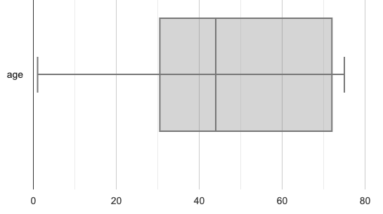
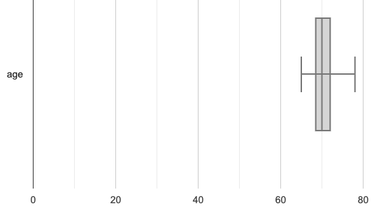
Students may notice that Q3 for both datasets is 72.
-
Students may notice that the median value for the Watson family data is a number that isn’t in the dataset, whereas the median value for the Ledet family data is a number that’s in the dataset.
-
Students may have questions about how to calculate the median and/or quartiles.
Now that we know how to compute a five-number summary, let’s practice!
-
Practice computing five-number summaries from small datasets (either 7 or 8 values) visualized as dot plots on Matching Dot Plots and Five-Number Summaries.
-
Be prepared to describe your strategy for matching dot plots with five-number summaries.
-
What strategies did you use to match dot plots to five-number summaries?
-
Responses will vary. Students will likely identify the median first to narrow in on a smaller pool of possible five-number summaries, and then compute the quartiles.
-
Dot plots 7 and 8 included 8 points, rather than 7. Did you need to change your strategy to complete these problems? If so, how?
-
The median was no longer the 4th datapoint in sequence. Instead, the median was the average of the 4th and 5th datapoints.
-
Which five-number summary on Matching Dot Plots and Five-Number Summaries has the greatest IQR?
-
Option C, which corresponds with dot plot 1.
-
Which five-number summary on Matching Dot Plots and Five-Number Summaries has the smallest IQR?
-
Option E, which corresponds with dot plot 6.
Synthesize
-
What is a quartile?
-
One of the three boundary points that splits our dataset into four equal quarters.
-
A quartile is sometimes / always / never one of the values in the dataset.
-
Sometimes.
-
Why is the IQR a more robust measure of variability than the range?
-
Because it focuses on the middle half of the data, so is less susceptible to outliers.
🔗Plotting our Five-Number Summary
Overview
Students plot five-number summaries as box plots before learning to make box plots in pyret.
Launch
To visualize the 5-number summary, the Range, and the Interquartile Range we can plot the five numbers on a number line and connect them to make a box plot.
-
Turn to Create Box Plots from Dot Plots.
-
Take a look at the example. What do you Notice? What do you Wonder?
To draw a box plot from a 5-number summary:
-
First, make a vertical line on the number line for each of the 5 values of the five-number summary.
-
Next, make a box connecting Q1 to Q3. This box contains the middle half of the data (IQR).
-
Make sure the line you drew for the median is tall enough to split the box into 2 parts (not necessarily equal!)
-
-
Finally, make a horizontal line (called a "whisker") connecting each end of the box to the minimum / maximum value. This helps us to visualize the full range of the data.
No matter what shape the box plot has, all four sections contain exactly the same number of points.
-
How do we know that the first quarter is the densest?
-
It is the narrowest, spanning just 2 units. And since all of the quarters contain the same number of data points, that tells us that these points are the most tightly packed.
-
We can see that the points on the dot plot are clustered more closely together in this section than they are in the others.
-
Which quarter of the data is the most dispersed? How do you know?
-
The last quarter; it spans 11 units, and includes the same number of data points as each of the other quarters.
-
We can see that there is lots of space between the points on the dot plot in this section.
-
Complete Create Box Plots from Dot Plots.
-
Then complete Matching Dot Plots and Box Plots.
-
What strategies did you use to match the dot plots to the box plots
-
Answers will vary. Sample responses may include:
-
I looked for the maximum and minimum values.
-
I looked at the shape of the data, starting with whether or not it was symmetrical.
-
I looked for tall clusters of points on the dot plot and matching narrow quarters on the box plot.
-
Investigate
-
Let’s practice making box plots with the data from the family gatherings.
-
Complete the second and third sections of Distribution of a Dataset.
The box plots should look like this:
Ledet: 
Watson: 
-
The average age at the Watson Family gathering was 70.4 year old.
-
The average age at the Ledet Family gathering was 44.3 years old.
-
For which family was the average age more typical?
-
For the Watson family gathering because the data is more closely clustered, the Range and IQR are significantly smaller, and the mean and median are much more similar.
-
How did making the box plots help you to understand the data?
-
What else do you Notice and Wonder?
Synthesize
-
Box plots have four sections. What must be true about all of those sections?
-
They each contain exactly one quarter of the data, no matter how different the sections look on the number line.
-
Why isn’t the median always in the middle of the box?
-
Because the median has to split the data itself in half and the quarter of the data to the left of the median isn’t necessarily clustered as tightly as the quarter of the data to the right of the median.
-
What part of the box plot represents the Range?
-
The full width from the end of the left whisker to the end of the right whisker
🔗Making Box Plots in CODAP
Overview
Students create box plots and five-number summaries from the animals dataset in CODAP.
Launch
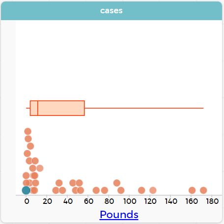
Let’s see what we can learn about the spread of the data in the pounds column by making a box-plot!
To create a box plot in CODAP, create a graph of randomly distributed points, then drag a quantitative column to the x-axis. From the Measure menu, select Box Plot. If this information is not on your Data Visualizations Organizer, add it now!
-
Log into CODAP, open your saved "Animals Starter File" and click "Run". If you don’t have the file, you can open a new one.
-
Turn to Summarizing Columns with Measures of Spread and follow the directions to complete the Summarizing the Pounds Column section.
Create a box plot in CODAP that visualizes the spread of Pounds.
ifnotslide{ }
}
Investigate
-
What conclusions can you draw about the distribution of values in this column?
-
While the animals' weights range from 0.1 pounds to 172 pounds, 50% of the animals weigh 11.3 pounds or less. The animal that weighs 172 pounds may be an outlier.
-
Now that we’ve explored the spread of the dataset, do you think the mean is the best measure of center for the animals' weights?
-
No. Most of the animals weigh far less than the average weight (of nearly 40 pounds)!
-
If Q1 is the value for which 25% of the animals weighed that amount or less, what does Q3 represent?
-
The third quartile is the value for which 75% of the animals weighed that amount or less. Another way of saying that would be that it is the value for which 25% of the animals weigh that amount or more.
-
Why do you think this visualization is sometimes called a "box and whisker plot"?
-
The distance between Min/Q1 and Q3/Max is drawn like whiskers!
-
Could we make a box plot for every column in the dataset?
-
No. We can only make box plots for quantitative columns.
If students are struggling to write conclusions, go over the following five number summary from the box plot they made.
-
Minimum (the left “whisker”) — the smallest value in the dataset . In our dataset, that’s just 0.1 pounds.
-
Q1 (the left edge of the box) — computed by taking the median of the lower half of the values. In the pounds column, that’s 3.9 pounds.
-
Q2 / Median value (the line in the middle), which is the middle Quartile of the whole dataset. We already computed this to be 11.3 pounds.
-
Q3 (the right edge of the box), which is computed by taking the median of the upper half of the values. That’s 60.4 pounds in our dataset.
-
Maximum (the right “whisker”) — the largest value in the dataset . In our dataset, that’s 172 pounds.
Choose another quantitative column to summarize and complete the second half of Summarizing Columns with Measures of Spread
Modified Box Plots
More Statistics-based or Math-oriented classes will also be familiar with modified box plots (video explanation), which remove outliers from the box-and-whisker and draw them as asterisks outside of the plot.
In CODAP, you can create a modified Box Plot by selecting both Box Plot and Show Outliers from the Measure menu.
Common Misconceptions
It is extremely common for students to forget that the quartiles divide the data into quarters, each of which includes 25% of the dataset. This will need to be heavily reinforced.
Synthesize
-
Is it safe to assume that the average typical?
-
No. It is sometimes typical. But sometimes there’s a lot of variation or skew in the data.
-
What percentage of points fall in the first quarter?
-
25%
-
What percentage of points fall in the second quarter?
-
25%
-
What percentage of points fall in the third quarter?
-
25%
-
What percentage of points fall in the fourth quarter?
-
25%
-
What percentage of points fall in the Interquartile Range (IQR)?
-
50%
-
What percentage of points fall within the Range?
-
100%
🔗Additional Resources
These materials were developed partly through support of the National Science Foundation, (awards 1042210, 1535276, 1648684, 1738598, 2031479, and 1501927).  Bootstrap by the Bootstrap Community is licensed under a Creative Commons 4.0 Unported License. This license does not grant permission to run training or professional development. Offering training or professional development with materials substantially derived from Bootstrap must be approved in writing by a Bootstrap Director. Permissions beyond the scope of this license, such as to run training, may be available by contacting contact@BootstrapWorld.org.


