(Using another tool? Please select it now: CODAP.)
Students learn to use box plots to describe the spread of a quantitative column, and then deepen their perspective on shape by matching box plots to histograms.
Lesson Goals |
Students will be able to…
|
Student-facing Lesson Goals |
|
Materials |
|
Supplemental Materials |
|
Preparation |
|
🔗Describing Spread
Overview
Students develop and practice using the vocabulary needed to describe the spread of box plots.
Launch
The Box Plots Card Sort activity students are about to complete requires some teacher preparation. Make sure you’ve printed and cut out a set of cards for each pair of students before proceeding.
If that preparation is unrealistic for you, project the images for students to refer to as they work through this section and modify the directions accordingly. (Viewing all of the images at once, rather than as individual cards, requires a higher cognitive load for students, so we don’t recommend it.)
Your teacher will give you and your partner an envelope containing lettered box plot cards. Lay out the cards in front of you.
-
What do you Notice about the box plots?
-
What do you Wonder about the box plots?
Investigate
Let’s sort some box plots!
-
With your partner, sort the cards into 2-3 logical piles of your choice.
-
Not sure how to group the cards?
-
We recommend thinking about the different features represented on the cards, including: range, IQR, median, and whisker length.
-
-
Record your groupings in section 1 of Sorting Box Plots.
-
Respond to questions 4 and 5. Be prepared to share your groupings and reflections with the class.
As you circulate, make note of the different groupings that students use; this will help with facilitation of class discussion and debrief. Encourage students to use appropriate vocabulary (i.e., IQR, range, median, quartile, whisker, etc).
Students should be familiar with the concept of "symmetry", given that they sorted histograms into symmetrical and asymmetrical groupings during Histograms: Visualizing "Shape". They may even be able to correctly use the terms "skew left" and "skew right", depending on their depth of understanding of those concepts.
Remind students that symmetry on a box plot, just like symmetry on a histogram, is not always precise; students should not expect a perfect mirror image every time. It is also important to remember that the data may have greater variability than the box plot presents.
-
What are the groupings you and your partner developed for this first round? Let’s hear about two different options.
-
symmetrical / skew left / skew right
-
IQR is evenly split (with the median at the center) / IQR is asymmetrically split
-
there are two whiskers / there is a different amount of whiskers
-
the IQR occupies all of the range / most of the range / just a small portion of the range
-
the median is greater than 50 / the median is less than 50
-
Note: Other groupings are certainly possible! The list above is just a sampling.
Do not invite every group to share; there are two more rounds of card sorting, and we want students to develop some of their own ideas.
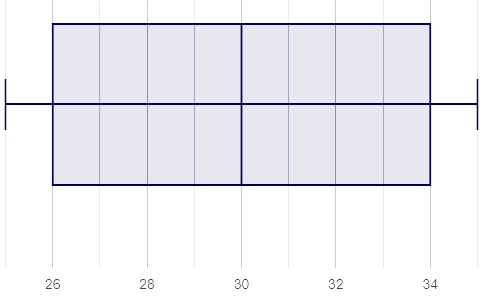
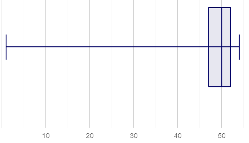
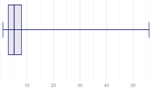
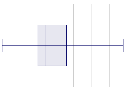
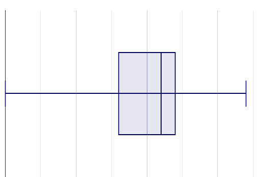
You probably noticed that some box plots have long whiskers to the left, and while others have long whiskers to the right.
Box plots, like histograms, can be characterized as "skew". Let’s compare skew-left, skew-right, and symmetric box plot shapes.
| Symmetric | Skew-left | Skew-right |
|---|---|---|
|
|
|
Values are balanced on either side of the center. |
Values are clumped around what’s typical, but trail off to the left. |
Values are clumped around what’s typical, but trail off to the right. |
As you debrief with students, encourage them to make sense of their groupings. In other words, rather than simply noticing that sometimes the whiskers are the same length, invite students to articulate what that can tell them about the distribution of the data.
-
Now let’s practice matching box plots to descriptions of the data’s distribution.
-
Complete Reading Box Plots.
Synthesize
-
Envision a skew-left box plot. If there are outliers, where would they be? Explain how you know.
-
Most of the data in a skew-left box plot is clustered at the high end of the range, with points trailing off to the left. Possible outliers would fall at the low end of the range.
-
The median is the middle value in a list of data points. Knowing this: How come the median is not always positioned in the middle of the IQR?
-
If the median is not in the middle, we know that quarters 2 and 3 do not span the same distance on the number line — but they do still contain the same amount of data! That data is simply more densely packed in one quarter compared to the other.
🔗Connecting Box Plots and Histograms
Overview
Students learn how to connect this visualization of spread to what they know about histograms.
Launch
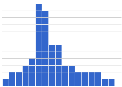
Box plots and histograms give us two different views of the shape of quantitative data.
| histogram | box plot A? | box plot B? |
|---|---|---|
|
|
|
-
Which of the box plots is displaying the same data as the histogram? How do you know?
-
Box plot A represents the same data as the histogram.
-
Sample response: The right whisker of the box plot A is longer, suggesting that there are outliers on the right causing the data to skew right.
Students may notice that the left part of the box is larger on the box plot B. Although that observation is correct, the box’s larger area does not indicate that more data points are clustered there. Remind students that an equal number of data points are clustered in each quadrant of the box plot. You can emphasize this core idea as you discuss the table comparing box plots and histograms,below.
| Intervals | Data points per Interval | Skew presents as | |
|---|---|---|---|
Box Plots |
Variable |
Fixed. 25% of the data is in each interval. |
A longer "whisker" or |
Histograms |
Fixed Bins |
Variable. Points “pile up in bins” |
A long tail of |
Investigate
The activity described below is a continuation of an activity launched during Histograms: Visualizing "Shape".
During that activity, students rotated around the room in teams of 3 to posters that were labeled "Skew Left", "Skew Right", and "Symmetric". At each poster, groups were directed to (1) sketch a histogram of the given distribution, and then (2) describe a dataset or scenario that would produce that data visualization.
A third section of each poster was left blank. During the subsequent activity, students will complete that third section.
-
Your teacher has instructed you and your group to stand in front of a poster that says "Symmetric", "Skew Left", or "Skew Right" at the top.
-
The paper in front of you should have a histogram and a description of a dataset / scenario that would produce the given distribution.
-
In the bottom section of the poster, sketch the box plot that would result in the distribution to match the histogram and scenario.
Spend some time debriefing with students, using the prompts below. Responses will vary for each group of students.
-
What strategies did you use to make sure that your histogram and box plots matched?
-
Did all of the box plots your classmates developed correctly represent the given scenario?
-
What information does a box plot convey that a histogram doesn’t?
-
What information does a histogram convey that a box plot doesn’t?
-
Use what you’ve learned about how box plots and histograms display data differently to complete Matching Box Plots to Histograms.
-
Complete Matching Box Plots to Histograms 2 and/or the Matching Box Plots to Histograms slide of Box plot practice (Desmos)
Now that you have the skills to interpret box plots, open the Animals Starter File and complete Data Cycle: Quantitative Distributions — Box Plots (Animals).
Synthesize
-
How do dense data clusters show up differently on histograms and box plots?
-
Histograms show data clusters as tall bars, whereas box plots show clusters as narrow quarters.
-
What features of a dataset are easier to identify on a histogram?
-
On a histogram, we can more easily identify the shape of the data, including peaks and gaps.
-
What features of a dataset are easier to identify on a box plot?
-
On a box plot, it is easier to locate the minimum, first quartile, median, third quartile, and maximum. Box plots help us to visualize spread.
🔗Data Exploration Project (Box Plots)
Overview
Students apply what they have learned about box plots to their chosen dataset. They will add three items to their Data Exploration Project Slide Template: (1) at least two box plots, (2) the corresponding five-number summaries, and (3) any interesting questions they develop.
To learn more about the sequence and scope of the Exploration Project, visit Project: Dataset Exploration. For teachers with time and interest, Project: Research Capstone is an extension of the Dataset Exploration, where students select a single question to investigate via data analysis.
Launch
Let’s review what we have learned about making and interpreting box plots.
-
Does a box plot display categorical or quantitative data? How many columns of data does a box plot display?
-
Box plots display a single column of quantitative data.
-
How are box plots similar to histograms? How are they different?
-
Box plots and histograms give us two different views on the concept of shape. Histograms have fixed intervals ("bins") with variable numbers of data points in each one. Box plots have variable intervals ("quartiles") with a fixed number of data points in each one.
-
A box plot lets us visualize the five-number summary. What does the five-number summary tell us about the column of data?
-
The five-number summary includes the minimum, medium, and maximum. It also includes the median of the lower half of the values, and the median of the upper half of the data points.
Investigate
Let’s connect what we know about box plots to your chosen dataset.
Students have the opportunity to choose a dataset that interests them from our List of Datasets in the Choosing Your Dataset lesson.
-
Open your chosen dataset starter file in Pyret.
-
Remind yourself which two columns you investigated in the Measures of Center lesson and make a box plot for one of them.
-
What question does your visualization answer?
-
Possible responses: How is the data for a certain column distributed? Are the values close together or really spread out? Are there any outliers?
-
Now, write down that question in the top section of Data Cycle: Quantitative Distributions — Box Plots (My Dataset)
-
Then, complete the rest of the data cycle, recording how you considered, analyzed and interpreted the question.
-
Repeat this process for the other column you explored before (and any others you are curious about).
If students want to investigate new columns from their dataset, they will need to copy/paste additional Measures of Center and Spread slides into their Exploration Project and calculate the mean, median and modes for the new columns.
Confirm that all students have created and understand how to interpret their box plots. Once you are confident that all students have made adequate progress, invite them to access their Data Exploration Project Slide Template from Google Drive.
-
It’s time to add to your Data Exploration Project Slide Template.
-
Find the box plot slide in the "Making Visualization" section and copy/paste your first box plot here. Duplicate the slide to add your other box plots.
-
Add the five-number summaries from these plots to the corresponding "Measures of Center and Spread" slides.
-
Be sure to also add any interesting questions that you developed while making and thinking about box plots to the "My Questions" slide at the end of the deck.
Synthesize
-
What shape did you notice in your box plots?
-
Did you discover anything surprising or interesting about your dataset?
-
What, if any, outliers did you discover when making box plots?
-
When you compared your findings with others, did you make any interesting discoveries? (For instance: Did everyone find outliers? Was there more or less similarity than expected?)
These materials were developed partly through support of the National Science Foundation, (awards 1042210, 1535276, 1648684, 1738598, 2031479, and 1501927).  Bootstrap by the Bootstrap Community is licensed under a Creative Commons 4.0 Unported License. This license does not grant permission to run training or professional development. Offering training or professional development with materials substantially derived from Bootstrap must be approved in writing by a Bootstrap Director. Permissions beyond the scope of this license, such as to run training, may be available by contacting contact@BootstrapWorld.org.

