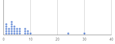
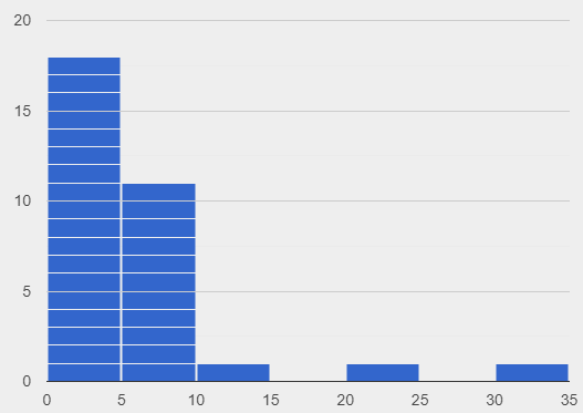
(Using another tool? Please select it now: CODAP.)
Students compare and contrast dot plots and histograms. Students learn to create histograms by hand and in Pyret.
Lesson Goals |
Students will be able to…
|
Student-facing Lesson Goals |
|
Materials |
|
Supplemental Materials |
|
Preparation |
|
🔗From Dot Plots to Histograms
Overview
Students learn about histograms, considering how they are both similar to and different from dot plots.
Launch
If you decided to launch today’s class using our Live Pyret Survey, now is the time!
When you click "Run", the How old is your Favorite Person?(Starter File) builds a side-by-side dot-plot and histogram comparison.
Assuming you’ve already…
-
Followed the Instructions to Set up and Link the Files
-
Shared the link you made to your class' copy of the How old is your Favorite Person? (Google Form)
The data visualizations will be generated using data from your students!
And they will continue to update in real time as more of your students complete the Google Form.
Project your screen and/or publish the starter file and share a link with your students.
Facilitate a discussion about this new-to-them Pyret Data Visualization!
-
Open the Google Form Survey link I shared and submit your response.
-
Then look at the Survey Results being displayed in the new Data Visualization on the Board.
-
What do you Notice?
-
What do you Wonder?
A histogram, like a dot plot, is data visualization that displays quantitative data. Let’s explore the ways that histograms are similar to and different from dot plots.
-
Turn to Comparing Dot Plots and Histograms.
-
Complete the first section. Be prepared to share your responses.
-
What do you Notice about the dot plot (left) and the histogram (right), which both display distribution of weeks?
-
Possible responses: the histogram has bars that are touching; I can see that the gaps and peaks are in the same place; I can’t see individual data points.
-
What do you Wonder about the dot plot and histogram?
-
Possible responses: Why do we need two displays that are so similar? How do I read and interpret a histogram? What are histograms useful for?
|
|
Investigate
Now, let’s think more deeply about the sort of information that dot plots and histograms provide us.
-
Use only the dot plot to answer the questions on the second section of Comparing Dot Plots and Histograms.
-
Record your responses in the dot plot column of the table. If there is a question that you cannot answer, put an X.
Next, we’ll use a histogram to answer the same questions.
-
Return to Comparing Dot Plots and Histograms.
-
Use only the histogram to answer the same set of questions. Record your responses in the histogram column of the table. If there is a question that you cannot answer, put an X.
-
Given that this is your first time interpreting a histogram: What questions do you have about reading a histogram?
-
Possible questions include:
-
How is this different from a bar chart? Histograms show the distribution of quantitative data, not categorical. Histograms' bars cannot be reordered, as they allow us to see the shape of a dataset. We can reorder bars in a bar chart.
-
Are the values on the tick marks included in the bar? On a histogram, each bar includes the left-end value but not the right-end value.
-
-
How was the size of the intervals (bins) determined? This is a great question! But it’s too big to tackle today. Bin size varies depending on the data being displayed. We will explore this and other questions about histograms in Histograms: Visualizing "Shape".
-
Respond to the questions in the Reflection section of Comparing Dot Plots and Histograms.
Invite students to share their responses, emphasizing the important idea that histograms display aggregate information rather than individual cases.
Histograms Don’t Display Individual Data Points!
Dot plots and histograms have a lot in common… so why is interpreting histograms a challenge for many students?
According to research conducted by Bakker, Biehler, and Konold (2005)Bakker, A., Biehler, R., & Konold, C. (2005). Should young students learn about box plots? In G. Burrill & M. Camden (Eds.), Curricular Development in Statistics Education: International Association for Statistical Education (IASE) Roundtable, Lund, Sweden, 28 June-3 July 2004., students are inclined to view data as individual cases. Histograms, however, display aggregate information.
How do we prevent this misconception? The authors have two recommendations:
-
Spend ample time learning about data visualizations where individual cases are visible to establish a solid foundation.
-
When aggregate plots are introduced, pair them with representations that allow students to see individual cases.
Let’s think more deeply about dot plots and histograms, two data visualizations of both the frequency and distribution of quantitative data.
-
Complete Matching Dot Plots and Histograms.
-
What was your strategy for matching dot plots and histograms?
Synthesize
-
How are the two displays alike?
-
They both display the frequency and distribution of quantitative data. They both show the total number of values.
-
How are the two displays different?
-
We can see individual points on the dot plot, but on the histogram, we just get a collective overview of the data. There is no way to single out one particular animal’s weight on the histogram.
-
When might a histogram be more useful than a dot plot? When might a dot plot be more useful than a histogram?
-
If we have a large dataset and we want to get a collective overview of the data, a histogram would be more useful. If we need to look at individual data points in a smaller dataset, we should use a dot plot.
🔗Creating and Reading Histograms
Overview
Students create histograms by hand and in Pyret, and then use the histograms to respond to questions about the data.
Launch
We have already discussed how histograms are similar to and different from dot plots: both display the frequency and distribution of quantitative data—but histograms give us a collective overview of the data, while dot plots allow us to see individual points.
During this lesson, we will get comfortable making histograms by hand and in Pyret.
-
Turn to the first section of Making Histograms and use the data provided to complete the frequency table and corresponding data visualization.
-
When you’re done, open Tooth Data Starter File and complete the second section of the page using Pyret.
Investigate
Let’s practice reading histograms.
If your students are new to histograms, you may want review the first section of Reading Histograms before having students move on to the second section. Some misconceptions that commonly emerge are highlighted below.
-
Complete Reading Histograms
Common Misconceptions
-
The tallest bar on a histogram does not necessarily represent the majority. A majority requires more than half of the data points. We need to ask ourselves: Is more than half of the data represented by the tallest bar?
-
Pay attention to what each axis measures! A tall histogram bar does not indicate a heavier dog. The height of the bar indicates frequency (how many dogs fall into a given 20-pound weight interval).
-
Unlike dot plots, histograms display aggregate data, meaning that it is impossible to identify single data points. The first histogram does not show us that one dog weighs exactly 140 pounds. There might be a dog with that weight, but we can’t know for sure unless we look at the dataset (or use our mouse to interact with the display in Pyret).
The common misconceptions cited above are from work by Kaplan et al (2014)Kaplan, J., Gabrosek, J., Curtiss, P., & Malone, C. (2014). Investigating student understanding of histograms. Journal of Statistics Education, 22(2)., Cooper and Shore (2008)Cooper, L., & Shore, F. S. (2008). Students’ Misconceptions in Interpreting Center and Variability of Data Represented via Histograms and Stem-and-Leaf Plots. _Journal of Statistics Education, 16(2), 1., and Bakker et al (2005)Bakker, A., Biehler, R., & Konold, C. (2005). Should young students learn about box plots? In G. Burrill & M. Camden (Eds.), Curricular Development in Statistics Education: International Association for Statistical Education (IASE) Roundtable, Lund, Sweden, 28 June-3 July 2004..
Synthesize
-
What does the height of a histogram bar indicate?
-
Histogram bar height tells us about the frequency of that data falling in a given bin.
-
Can we use a histogram to determine the exact range of a dataset?
-
No: A histogram’s bars provide an aggregate view of the data.
-
We cannot identify single data points, so we can neither identify the minimum n or maximum.
-
The lowest data point could fall toward the low or high end of the first bin, or anywhere in between. And the highest data point could fall anywhere in the last bin.
-
Can we identify how many data points are in a dataset from a histogram?
-
Yes. Assuming that the y-axis is clearly labeled, we can add the bar heights to determine how many data points are in a dataset. This of course becomes more complicated when we have larger datasets.
These materials were developed partly through support of the National Science Foundation, (awards 1042210, 1535276, 1648684, 1738598, 2031479, and 1501927).  Bootstrap by the Bootstrap Community is licensed under a Creative Commons 4.0 Unported License. This license does not grant permission to run training or professional development. Offering training or professional development with materials substantially derived from Bootstrap must be approved in writing by a Bootstrap Director. Permissions beyond the scope of this license, such as to run training, may be available by contacting contact@BootstrapWorld.org.


