Students discovery why they investigated pandemic data using only one state, learning about Simpson’s Paradox in the process!
Lesson Goals |
Students will be able to…
|
Student-facing Lesson Goals |
|
Materials |
|
Preparation |
|
🔗Why Just One State at a Time?
Overview
Students discuss an example of Simpson’s Paradox, which motivates splitting a dataset into grouped samples using filters. They then discover another motivation for filtering: scatter plots like our covid dataset show multiple correlations, instead of just one. Finally, they learn how to filter a dataset and apply that knowledge to filtering the Covid dataset into samples grouped by state.
Launch
The first table and accompanying questions below can be printed here, if that would work better for your students.
A college is looking at enrollment and housing data for students who’ve decided what their major will be, vs. those who are undecided:
| # On Campus | # Off Campus | % On Campus | |
|---|---|---|---|
Undecided |
120 |
80 |
120/200 = 60% |
Decided |
80 |
100 |
80/180 = 44% |
-
According to the table, how many Undecided Majors live off-campus?
-
80
-
How many Decided Majors live on-campus?
-
80
-
Who is more likely to live on campus: Decided or Undecided Majors?
-
(Give students time to talk about this, and explain their thinking! )
It looks like the two variables are significantly related: undecided majors are more likely to live on campus than decided ones!
But there’s a third variable hiding in the background: freshmen college students are far less likely to have picked a major than seniors, and they are much more likely to live on campus.
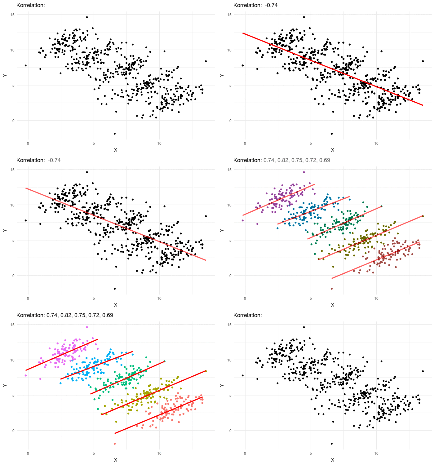
When we filter by this important third variable, it turns out that there is no correlation between between deciding on a major and living on- or off-campus, for both Freshmen and Non-Freshmen.
|
|
What looks like a correlation between having-a-major and living-on-campus is actually a correlation between age and living-on-campus.
 A third variable lurking in the data can play tricks by obscuring relationships between two other variables — or by creating the appearance of a relationship where none exists!
We often think that the more data we include in our sample the more clearly we’ll see any potential relationships. But, in certain circumstances, the correlations in our sub-groups cancel each other out when we put the groups together. This is called Simpson’s Paradox.
Simpson’s Paradox: visible trends in sub-groups disappear or even reverse when the groups are combined.
Investigate
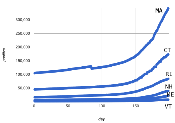
Sometimes filtering the data into subsets is the only way to see what’s really going on. In our Covid Spread Starter File, the subgroups had such strong relationships that the scatter plot for all our New England states doesn’t look much like a scatter plot at all — it looks like someone took a marker and drew in five different curvy lines!

-
How is a grouped sample different from a random sample?
-
A grouped sample is a non-random subset chosen from a larger set. Grouped samples are non-random by design!
-
What variable(s) might be lurking in the background of the Covid Spread Data, that could be responsible for the distinct curves for each state?
-
Give students time to discuss!
-
Diseases spread more rapidly in densely-populated areas, since it’s easier for the infection to jump from one person to another. Unfortunately, we can’t see the density data in our table, so that dimension is missing from our dataset! This is exactly what happened in our college example: we couldn’t see the age of the students, which skewed our interpretation of the scatter plot.
Make sure you’ve advanced your teacher dashboard of Modeling Covid Spread (Desmos) to the fifth slide ("Exponential Model for VT") so that students will be looking at the correct screen when they are directed to return to Desmos part way through Models for Vermont
Now that we’ve explored the Massachusetts data, we are ready to explore some of the other subsets.
-
Working in pairs or small groups, complete the first section of Models for Vermont using the Covid Spread Starter File.
-
What are
is-MAandMA-tabledoing? -
is-MAis a helper function that is used to check every Row of the Table, producing true if it’s from Massachusetts or false if it’s not from Massachusetts. -
MA-tableuses thefilterfunction to make a new table, using all the Rows from the original table for which the helper function produced true.
While filtering is introduced in this lesson, the primary goal is for students to explore exponential functions. If your students want to know more about filtering — or wish to filter other datasets — we recommend checking out the Filtering and Building lesson.
-
Complete Models for Vermont.
-
You will need both the Covid Spread Starter File and Slide 5 of the Modeling Covid Spread Desmos file.
Common Misconceptions
It’s extremely common for students to believe that filtering a table changes the original table, but this is NOT how it works in Pyret! Instead, the filter function always produces a new table, containing only the Rows for which the supplied function evaluates to true.
Synthesize
-
How would you explain Simpson’s Paradox to someone who missed class today?
-
In what other situations would it be useful to filter a dataset?
-
Can you think of other examples where Simpson’s Paradox might arise?
-
When comparing school in Country A to schools in Country B, a researcher finds that students living in poverty in A outperform impoverished students in country B. They also find that the wealthy students in A outperform their wealthy peers in B. In fact, for every income level, Country A outperforms Country B! But if Country B has less child poverty overall, it will still outperform A.
-
Another, thoroughly-explained example involving soft drinks can be found on this web page.
These materials were developed partly through support of the National Science Foundation, (awards 1042210, 1535276, 1648684, 1738598, 2031479, and 1501927).  Bootstrap by the Bootstrap Community is licensed under a Creative Commons 4.0 Unported License. This license does not grant permission to run training or professional development. Offering training or professional development with materials substantially derived from Bootstrap must be approved in writing by a Bootstrap Director. Permissions beyond the scope of this license, such as to run training, may be available by contacting contact@BootstrapWorld.org.
