Students learn how to fit a linear model to a scatter plot, using the S-value (Standard Deviation of Residuals) of model fitness.
Lesson Goals |
Students will be able to…
|
Student-facing Lesson Goals |
|
Materials |
|
Supplemental Materials |
|
Preparation |
|
🔗Seeing Patterns, Building Models
Overview
Students learn that the patterns they intuitively see in a scatter plot represents a relationship between the explanatory and response variables, called a model. They consider two different models for a simple dataset, and brainstorm how we could measure which fits better.
Launch
Pyret has a function for making scatter plots, which has four things in its Domain:
-
The table containing all the data
-
The name of the column to use for labels
-
The name of the column to use for the x-coordinates (xs)
-
The name of the column to use for the y-coordinates (ys)
Here’s the Contract:
# scatter-plot :: (Tabletable-name, Stringlabels, Stringxs, Stringys) -> Image
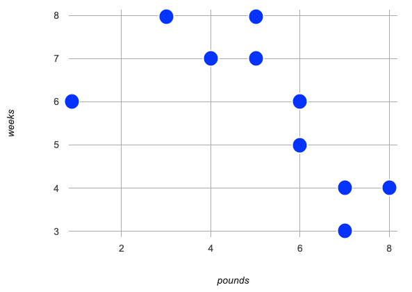
Let’s see if there’s a correlation between an animal’s age in the shelter, and the weeks it takes to be adopted.
-
Open the Lizard Sample Starter File.
-
Make a scatter plot, using the animals'
nameas the labels, their weight inpoundsas the explanatory variable on the x-axis, and theweeksit took to be adopted as the response variable on the y-axis.
-
Do you see a pattern here, that relates
weekstopounds? If so, how would you describe it? -
The goal is to draw out student-generated notions, that may or may not include formal language, e.g.
-
"It looks like weeks to adoption generally decreases as the lizards get heavier."
-
"I see a shape in the points the looks like this (motions with arms)."
-
"The points seem to be clustering around a diagonal line with a negative slope."
-
-
If a new lizard appeared that weighed 2 pounds, how long would you predict it would take to be adopted?
-
I’m not 100% sure, but I would expect it would probably take between 7 and 10 weeks, and it would certainly be surprising if it took less than 6 weeks to be adopted.
-
How did you make your prediction?
-
I pictured a line.
-
I pictured a wide paint brush going backwards through the points starting from the right until I got to 2.
-
I thought about what point might come between (1,6) and (3,8)… which was (2,7) and then decided that based on the other points on the graph that point would probably be a little higher.
Teaching Tip
Project the scatter plot at the front of the room, and have students come up to point out their patterns.
-
Turn to the first section of How could we Measure Whether a Model is a Good Fit? (Lizards) and use a straightedge to draw a line that summarizes the trend you see in the data.
-
Think about how you would describe the line:
-
Can you name two points that it would pass through?
-
Can you identify its slope?
-
Where do you picture it crossing the y-axis?
-
By drawing a line through our cloud of points, we are defining a Model: a summary of the relationship between two variables in a dataset. This model allows us to make predictions about how long a new animal will stay at the shelter.
Data = Model + Error
No line will touch every dot, so every model will have some error, compared to the original data! But if the line is close enough to enough of the dots, the model can still help us reason about adoption time.
The line that is closest to all the other points is known as the line of best fit, meaning it is the best possible summary of the relationship and therefore the best possible model.
Investigate
While most of us might have pictured similar lines (models!), it’s likely that different people see slightly different lines. How do we know which model is best? How do we know whose model has the least error?
-
Turn to the second section of How could we Measure Whether a Model is a Good Fit? (Lizards).
-
With your partner, discuss Cy and Jo’s models and complete the questions on the page.
Synthesize
-
What criteria did you come up with for how to assess whether or not a model is a good fit for the data?
-
Answers will vary. Ideas might include:
-
The points should be as evenly distributed around the model as possible.
-
We could see how the number of points above the line and below the line compare.
-
We could measure the distance between the points and the line and try to make sure the average distance above is balanced with the average distance below.
-
-
How could we measure the distance between the data points and the linear model?
-
Answers will vary. Ideas might include:
-
By drawing vertical lines connecting each data points to the linear model.
-
By drawing horizontal lines connecting each data points to the linear model.
-
By drawing diagonal lines connecting each data points to the linear model.
Push students to recognize that in order for this measurement to be useful they would have to be perpendicular to the linear model! -
By drawing squares with one corner on the data point and the opposite corner on the linear model.
🔗Introducing S
Overview
Students test out their linear models using a Pyret function called fit-model, which draws the residuals and computes a measure of fitness called the Standard Deviation of the Residuals (S).
Launch
Pyret has a function called fit-model, that takes in a function and graphs it on top of a scatter plot.
-
Take a look at the contract for
fit-modelin your contracts page. What is its Domain? -
Like
scatter-plot, it consumes columns for our labels, our xs, our ys… -
Unlike
scatter-plot, it consumes a function!
-
Take a few minutes to consider the code and data visualizations on Introducing fit-model.
-
Record your observations and be ready to share them with the class.
|
|
-
What do you Notice?
-
What do you Wonder?
-
Compare the
fit-modeldisplay forcyto thefit-modeldisplay forjo. How are they similar? How are they different? -
Both models have a blue line and red dots.
-
The x-axis goes from 0 to 8 for both of them.
-
The y-axis for
cyis numbered 0 to 20. It goes from 3 to 9 forjo. -
johas more red dots below the blue line than above it. -
The data points for
jomore or less fill the vertical space of the display, whereas forcythere are only data points in the bottom half of the display.
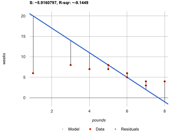
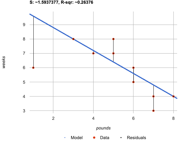
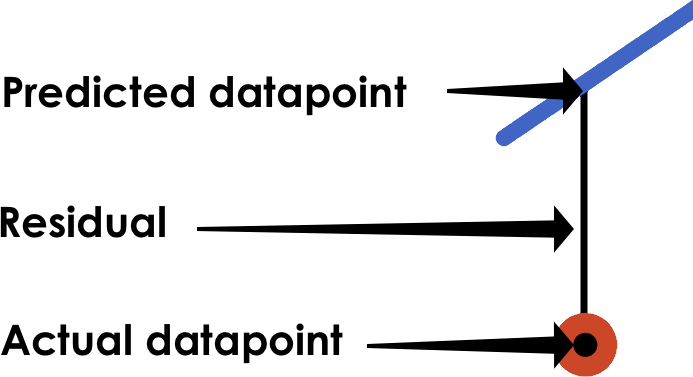 When we graph a model in Pyret, we can see that:
-
some of the points are close to the line ("real" y is close to "predicted" y)
-
some points are quite far away ("real" y is far from "predicted" y)
The difference between any real y and predicted y is called the residual, and it measures how far off that one point in the model is from the actual data. The smaller the residuals, the better a model fits!
-
There are three terms in the legend at the bottom. What do they refer to?
-
The blue line is the model.
-
The red dots are the data from the data set.
-
Residuals refer to the vertical black lines connecting the data points to the model, representing the distance between the data and the value the model predicts. They vary in length depending on how far above or below the model the data is situated.
-
How do S and R2 compare for the two models?
-
The values are positive for both models and both S and R2 values are smaller for
jothan they are forcy. -
Based on the S values of the plots you created on this page, what do you think S means?
-
Answers will vary, but students should have some sense of the idea that if one model has a lower S value than another model of the same data it indicates a better fit.
Just as there are different tools for finding the center or spread of a dataset, there are many different tools to calculate the fitness of a model, including S and R2 , which you just saw when fitting the models in Pyret.
Statisticians and Data Scientists are careful to use the right tool for the job!
-
We want a measure that takes the values from every data point into account.
-
We want a measure of error, so the measure should be zero for a perfect model fits every point (i.e. has no residuals).
-
We want a measure that’s concrete, and easy to understand.
S is a measure of fitness, which refers to the Standard Deviation of the Residuals.
-
The closer the data points are to the model, the smaller the residuals are.
-
In a perfect fit to the data, S would be 0.
-
S is expressed in terms of units of the response variable (the y-axis), which makes it easy to understand.
-
When fitting a model to this dataset, an S of 5 means "the standard deviation of the residuals is 5 weeks to adoption."
-
-
When comparing two models for the same dataset, the model with the smaller S is the better model!
-
It doesn’t make sense to compare S for models that describe different datasets.
The S-value always has to be considered in the context of the range of values that the model is predicting!
-
Turn to Considering S in Context.
-
Consider the S-value of each model in the context of the range of the data described.
-
Decide how well the model is likely to predict values.
-
Did you strongly agree that any of the models described were a good fit? Why?
-
Both 2 and 8
-
Because the numbers in the range were huge and the S value was really small.
-
Did you strongly disagree that any of the models were a good fit? Why?
-
Both 1 and 6
-
Because the S-value was big in comparison to the range.
-
For the first scenario the S-value was 300, which was the majority of the range between 0 and 400.
-
For the sixth scenario, even though the S-value was only 1, it was much bigger than any of the numbers in the range, which maxed out at two hundredths.
Now that we have a basic sense of what fit-model does, let’s see it work live in Pyret!
-
Return to the Lizard Sample Starter File.
-
Notice that the functions you were just looking at are defined on lines 16 and 17 of the Definitions Area.
-
Following this you will see two
fit-modelexpressions: one takes in the function forcyand the other takes in the function forjo.
-
-
Uncomment the last two lines of code and click "Run".
-
How do we know that the first Interactive Chart that pops up is fitting Cy’s model to the data?
-
Because the first expression in the Definitions Area takes in
cy. -
Move your mouse along the line. What information can we learn from the "Model" pop up windows?
-
The coordinates of any point in the model.
-
Move your mouse to a few different points and read the information contained in these pop ups. What can we learn from the "Data" pop up windows?
-
The x and y coordinates of each point in the data set, and the animals they are associated with.
-
Find the "Residuals" pop up window by hovering your mouse near any of the data points. Find and read a few of these. What can we learn from the "Residuals" pop up windows?
-
The x and y coordinates of a data point
-
The predicted y-value (
ŷ) for that x-value -
The "Residual": the difference between
yandŷ
-
We’ve been looking at how well
cy's model fit the data. What do we need to do if we want to see how welljo's model fits the data. -
Close the window and another interactive chart will pop up.
-
What happens once we close the second interactive chart?
-
We see clickable thumbnail images of both charts in the Interactions Area.
Optional: Which Model is Best?
If students know how to compute the equation of a line that crosses between two points, use From Lines to Functions to have them define their models for age v. weeks in Pyret and use fit-model to see which one is best.
Let’s put everything we’ve learned together and interpret the models we’ve built and the statistics we’ve gathered about them.
-
Let’s make sure we know what the models we’ve built and the statistics we’ve gathered about them mean.
-
Complete the first section of Interpreting our Models with your partner.
-
Confirm that your students are able to complete cy’s model correctly.
-
If your students did not complete From Lines to Functions, direct them to ignore the last section of the page they are about to complete.
-
Complete Interpreting our Models.
Heads up: You will be using percent change to make sense of how the expected errors in these models compare.
How can r2 be less than zero?
Sharp-eyed students might wonder how it’s possible for an r2 to be less than zero. That’s supposed to be impossible, right?
It turns out that the R2 of a model is NOT computed by squaring R, and only actually equals R × R when the model is produced through linear regression. Remember: linear regression can only find the line of best fit, so it will never produce something crazy like a negatively-sloping line for a dataset with a positive correlation!
When students are coming up with models on their own, they aren’t bound by the algorithm for linear regression and can come up with lines whose fit is worse than lr-plot could ever be!
Synthesize
-
Why do we need to know the Range of the dataset in order to interpret an S-value?
-
Because S-values tell us the expected error in units of the variable on the y-axis. An error of $1000 could be huge or minuscule depending on the context.
-
Besides looking at the S-value, what might you look for to determine whether a linear model is a good fit for the data?
-
That the average distance of the points above the line appears to be about the same as the average distance of the points below the line.
What about Non-linear Models and Algebra 2?
There’s no reason things have to stop at line of best fit! Algebra 2 and Integrated 3 teachers — or Data Science teachers looking to count their course as an alternative to Algebra 2 — can extend this modeling work using our Algebra 2 materials, which covers quadratic, exponential, logarithmic, and periodic models!
🔗Additional Practice
-
The Fit Flights Desmos Activity, Inspired by Illustrative Mathematics and OpenUp Resources, has students place a line on a scatter plot, trying to max out a meter that measures the goodness of the fit. We recommend it as additional practice for homework or a do now after completing this lesson.
-
For more practice deciding and articulating which model is better:
-
Have your students complete How could we Measure Whether a Model is a Good Fit? (Cheerios).
-
They can then practice fitting the models to test their work using the Cheerios Starter File.
-
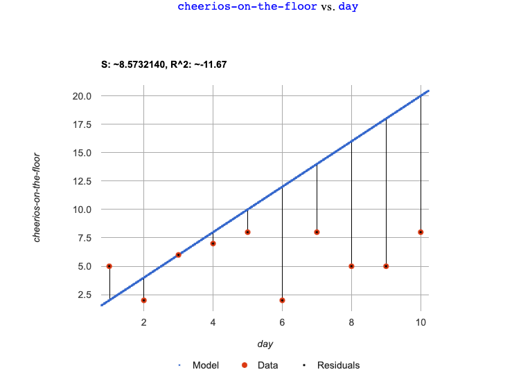
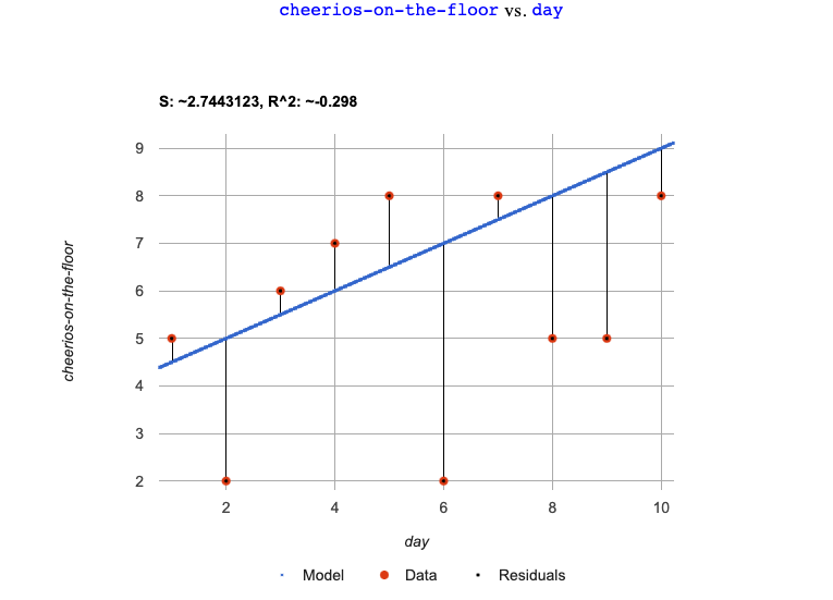
The models they’ll be working with will look like this:
|
|
|
|
These materials were developed partly through support of the National Science Foundation, (awards 1042210, 1535276, 1648684, 1738598, 2031479, and 1501927).  Bootstrap by the Bootstrap Community is licensed under a Creative Commons 4.0 Unported License. This license does not grant permission to run training or professional development. Offering training or professional development with materials substantially derived from Bootstrap must be approved in writing by a Bootstrap Director. Permissions beyond the scope of this license, such as to run training, may be available by contacting contact@BootstrapWorld.org.

