(Using another tool? Please select it now: Pyret.)
Students explore how their understanding of histogram "shape" can help them to interpret data.
Lesson Goals |
Students will be able to…
|
Student-facing Lesson Goals |
|
Materials |
|
Preparation |
There is an activity during this lesson that requires flip chart paper, tape, and markers. Before class, tape flip chart paper to the walls of your classroom—one poster per team of three students. On each piece of flip chart paper, write "Skew Left", "Skew Right", or "Symmetric", and then draw lines to divide the paper horizontally into three equal sections. Note that when the lesson is over, you will want to save students' chart papers for use during Introduction to Box Plots. |
🔗Interpreting Shape
Overview
Students consider what different distributions tell us about a dataset, connecting different scenarios with different data visualizations.
Launch
We now have the terminology needed to describe histogram shape. But what can we actually conclude about a dataset based on a histogram’s shape?
Let’s consider two different scenarios:
-
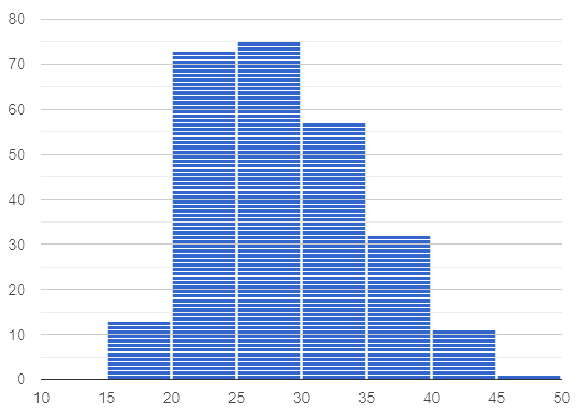
The average US woman gives birth around age 26, but some do even after 45! Children do not give birth.
-
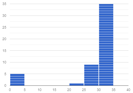
Most adults have close to a full set of 32 teeth, but a few hockey players might have a very small number of teeth. No one has more than 32 teeth.
Draw a rough sketch of what you think the histogram for each of these scenarios might look like.
Invite a student to the board to draw a rough sketch of each scenario. Invite the students to describe how they decided where to draw the clusters, peaks, and outliers. Encourage students to label at least a few values on the x-axis to guide their thinking.
Below are two correct samples; remember that these data visualizations need not be precise.
|
|
-
Which of the scenarios describes a right skew: adult teeth or women’s ages at childbirth? Explain.
-
The scenario about women’s ages describes a right skew. Most of the data is clustered around 26, but there is also data further on the right, all the way up to 45. There is no data around, say, age 7.
-
Which of the scenarios describes a left skew: adult teeth or women’s ages at childbirth? Explain.
-
The scenario about teeth describes a left skew. Most of the data is clustered around 32 with a few outliers further to the left.
-
With a partner, complete Using Shape to Interpret Data.
-
Just like we did during the warm up, you will sketch rough histograms, make a decision their shape, and then interpret the data.
Investigate
There is some setup required for the interactive activity that follows.
-
You will need flip chart paper, tape, and markers.
-
Divide your class into teams of three. All around your classroom, tape flip chart paper to the wall—one poster per team of three students.
-
On each piece of flip chart paper, write "Skew Left", "Skew Right", or "Symmetric", and then draw lines to divide the paper horizontally into three equal sections.
-
Your teacher has instructed you and your group to stand in front of a blank poster that says "Symmetric", "Skew Left", or "Skew Right" at the top.
-
The paper is divided into three horizontal sections. In the top section of your paper, draw a histogram that matches the shape assigned to you.
Once all students have drawn their histograms, direct them to rotate to the next poster with a different shape.
-
You are now standing in front of a poster that identifies a shape and also includes a histogram of that shape.
-
In the second horizontal section of the poster, write a scenario or describe a dataset that would result in that distribution.
-
Leave the third section of the poster blank. We will use it another day!
-
Take a few minutes to walk around the classroom and read the scenarios your peers developed. Return to your seat when you have had a chance to see all of the posters.
Spend some time debriefing with students, using the prompts below. Responses will vary for each group of students.
-
Did all of the scenarios your classmates developed correctly represent the given shape?
-
Did you notice any especially creative scenarios? Any surprising scenarios?
-
Were there any scenarios that were represented more than once? Why do you think those scenarios were popular?
The third section of the posters will remain blank today. Students will complete this section in the future during Introduction to Box Plots.
Try it on your own! Complete Reading Histograms, where you will match descriptions of video ratings to histograms that could fit the data.
Go over correct responses as a class.
Synthesize
-
What strategies did your group use in brainstorming scenarios to match histogram shape?
-
For which distributions was it easiest to come up with an example?
-
For which distributions was it hardest to come up with an example?
🔗Histograms and Measures of Center
Overview
Students apply their combined knowledge of histograms, measures of center, and shape.
Launch
Let’s try computing and interpreting different measures of center from a histogram!
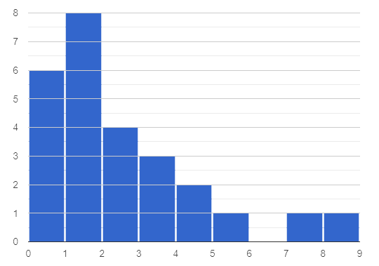
This histogram shows the number of children per home in the Broadmoor neighborhood.
-
What is the median number of children per home?
-
The median number of children per home is 1.
-
Strategy 1: List out the raw data (0, 0, 0, 0, 0, 0, 1, 1, 1, 1, 1, 1, 1, 1, 2, 2, 2, 2, 3, 3, 3, 4, 4, 5, 7, 8) then locate the middle value.
-
Strategy 2: Determine the total number of homes represented by adding columns' heights (6 + 8 + 4 + 3 + 2 + 1 + 1 + 1 = 26), then locate the 13th and 14th values on the histogram.
-
Students may mistakenly attempt to find the midpoint of the values on the horizontal axis (4.5), indicating that they connect median with “middle”, but misunderstand what middle value to find.
-
What is the mean number of children per home?
-
Approximately 2.04. Note that students may attempt to use the “add up and divide” algorithm with inappropriate data values from the display. Students may mistakenly compute the mean height of the bars, or the mean of values on the horizontal axis.
Students often cannot compute measures of center from histograms because they lack attention to the context of the data. Cooper and Shore (2008) suggest that when students are confused, simply ask "What are the data?" to help reorient and redirect students. Similarly, urge students to discuss and defend their responses.
Investigate
We were able to access all raw data by looking at the histogram displaying number children per home in the Broadmoor neighborhood. That is not always the case!
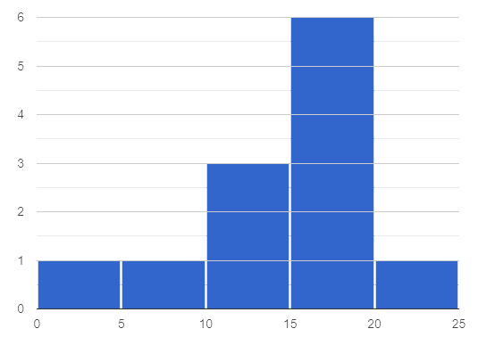
This histogram displays how many miles Emma ran per month in 2023.
-
Are there any months when Emma ran exactly 3 miles?
-
Trick question! It’s impossible to tell from the display. Remind students that we cannot see individual points on a histogram, therefore will need to make approximations (and think about the effect of outliers!) when thinking about measures of center.
-
What is the mode number of miles Emma ran per month?
-
We can’t determine exactly what the mode(s) might be, or even if there is a mode in this dataset. We can see that during most months of 2023, Emma ran between 15-20 miles.
-
Approximate the median number of miles Emma ran per month in 2023.
-
The 6th and 7th values fall in the 15-20 miles bin, so the median is a value between 15 and 20 miles.
-
Which is probably greater: the median or the mean?
-
Because there are outliers to the left, the mean is probably less than the median.
-
Work with a partner to complete Histograms and Measures of Center.
-
Which problem was the most challenging? Why did you find it challenging?
Discuss solutions with students.
-
Choosing "sixth graders" for the the first problem suggests that students understand the concept of mode, but looked at bar height (indicating frequency) instead of considering the value on the x-axis.
-
Ensure that when finding the median (problem 2), students do not simply locate the center of the x-axis; instead, they need to look at the data presented on the histogram.
-
When comparing the median and mean on a histogram, encourage students to approximate the location of the median and then consider the effect of outliers on the mean.
Note: Both the problems on Histograms and Measures of Center and in the Launch are drawn from or inspired by research conducted by Cooper and Shore (2008)Cooper, L., & Shore, F. S. (2008). Students’ Misconceptions in Interpreting Center and Variability of Data Represented via Histograms and Stem-and-Leaf Plots. _Journal of Statistics Education, 16(2), 1..
Synthesize
-
How was interpreting mean, median, and mode from a histogram different than computing it from a raw dataset?
-
Responses will vary. Students should explain that they needed to understand the meaning of the bar height and the values on the x-axis in order to arrive at correct measures of center.
-
Describe how the relationship between mean and median can help you draw a conclusion about the skewness of a histogram. (For example: When the mean is greater than the median, I know that…)
-
When the mean is greater than the median, outliers on the right cause the display to be skewed right. When the mean is less than the median, outliers on the left cause the histogram to be skewed left.
🔗Histograms and Variability
Overview
Students consider variability as deviation from the mean, and then assess the variability of histograms.
Launch
We’ve made lots of different data visualizations for the animals in the shelter.
-
Can you predict what the histogram would look like if every animal in the shelter had approximately the same weight?
-
The histogram would have one bar that was very tall, which would include all of the animals.
-
Does the histogram you described represent a dataset of high or low variability?
-
The histogram has low variability: the range is small, and each of the data points are similar to one another.
So far, we have defined variability in two ways:
-
how alike or unlike the data is (categorical data)
-
range (quantitative data)
In this lesson, we will consider another way of describing variability: deviation from the mean.
-
If all the animals have roughly the same age, we can conclude that there will be extremely little variation from the mean.
-
A large spread and the presence of outliers result in greater variation from the mean.
Investigate
-
Which dataset below has the least variability from its mean? Explain.
-
Histogram A varies the least from its mean. The mean of the data is also the mode, and outliers are evenly distributed on both sides.
A
|
B
|
Invite a variety of students to share and explain their responses. Students commonly believe that a flatter histogram equates to less variability in the data than a bumpy histogram (Kaplan et al, 2014Kaplan, J., Gabrosek, J., Curtiss, P., & Malone, C. (2014). Investigating student understanding of histograms. Journal of Statistics Education, 22(2).). In other words, when reporting on variability, students mistakenly focus on frequency (y-axis) rather than data values (x-axis).
-
With a partner, complete Histograms and Variability.
-
Provide an explanation for each response that you give. Be prepared to share your answers with the class.
Histograms and Variability includes three challenging questions. If students are struggling, encourage them to imagine the dot plot data visualization of each histogram. Oftentimes, thinking about individual datapoints can support students strengthening their reasoning.
Synthesize
Many students equate variability with range.
-
How can we determine which of two histograms shows greater variability if the two histograms have the same range?
-
We can think of variability as deviation from the mean. Once we have located the mean of a histogram, we can consider if data points are more likely to fall near or far from the mean.
🔗Data Exploration Project (Visualizing Shape)
Overview
Students apply what they have learned about visualizing shape to the histograms they have created for their chosen dataset. They will add to their Data Exploration Project Slide Template a more detailed interpretation of their histograms using new vocabulary.
Visit Project: Dataset Exploration to learn more about the sequence and scope. Teachers with time and interest can build on the exploration by inviting students to take a deep dive into the questions they develop with our Project: Research Capstone.
Launch
Let’s review what we have learned about visualizing the shape of data.
-
Describe a histogram that is skewed right.
-
Are its outliers high or low?
-
-
Values are clumped around what’s typical, with low outliers.
-
Describe a histogram that is skewed left.
-
Are its outliers high or low?
-
-
Values are clumped around what’s typical, with high outliers.
-
Describe a histogram that is symmetric.
-
It’s just as likely for the variable to take a value a certain distance below the middle as it is to take a value that same distance above the middle.
Apply what you’ve learned by completing Data Cycle: Quantitative Distributions (Animals) — Histograms.
Investigate
Let’s connect what we know about visualizing the shape of the data to your chosen dataset.
-
Open your chosen dataset starter file in CODAP.
-
Choose one quantitative column from your data set that you will represent with a histogram.
-
Create the histogram.
-
What question does your display answer?
-
Possible response: What is the shape of a particular quantitative column of my dataset?
For the activity below, you can either (1) direct students to use one of the blank copies of the Data Cycle in the back of their workbook or (2) print copies of Data Cycle: Quantitative Distributions (My Dataset) — Histograms for students to use.
-
Write that question down in the top section of a blank Data Cycle.
-
Then, complete the rest of the data cycle.
-
Be sure to integrate the new vocabulary we have learned, including: shape, skewed left, skewed right, and symmetric. }
It’s time to add to your Data Exploration Project Slide Template.
-
Copy/paste at least two histograms. Be sure to also add any interesting questions that you developed while making and thinking about histograms.
-
Be sure to integrate the new vocabulary we have learned, including: shape, skewed left, skewed right, and symmetric.
-
Describe what this shape tells you about the quantitative columns you chose.
You may need to help students locate the "Histogram" slide in the "Making Displays" section. They will need to duplicate the slide to add their second display. The "My Questions" section is at the end of the slide deck.
Synthesize
Have students share their findings.
-
What shapes did you notice in your histograms?
-
Did you discover anything surprising or interesting about your dataset?
-
Were there any surprises when you compared your findings with other students?
These materials were developed partly through support of the National Science Foundation, (awards 1042210, 1535276, 1648684, 1738598, 2031479, and 1501927).  Bootstrap by the Bootstrap Community is licensed under a Creative Commons 4.0 Unported License. This license does not grant permission to run training or professional development. Offering training or professional development with materials substantially derived from Bootstrap must be approved in writing by a Bootstrap Director. Permissions beyond the scope of this license, such as to run training, may be available by contacting contact@BootstrapWorld.org.

