(Using another tool? Please select it now: CODAP.)
Students investigate scatter plots as a method of visualizing the relationship between two quantitative variables. In the programming environment, points on the scatter plot can be labelled with a third variable!
Lesson Goals |
Students will be able to…
|
Student-facing Lesson Goals |
|
Materials |
|
Supplemental Materials |
|
Preparation |
|
Key Points For The Facilitator |
|
🔗Introducing Scatter Plots
Overview
Students are introduced to scatter plots, visualizations that show the relationship between two quantitative variables and learn how to construct them by hand.
Launch
If you decided to launch today’s class using our Live Pyret Survey, now is the time!
When you click "Run", the Who we live with: Pets vs. People (Starter File) builds a scatter plot.
Assuming you’ve already…
-
Followed the Instructions to Set up and Link the Files
-
Shared the link you made to your class' copy of the Who we live with: Pets vs. People (Google Form)
The data visualizations will be generated using data from your students!
And they will continue to update in real time as more of your students complete the Google Form.
Project your screen and/or publish the starter file and share a link with your students.
Facilitate a discussion about this new-to-them Pyret Data Visualization!
-
Open the Google Form Survey link I shared and submit your response.
-
Then look at the Survey Results being displayed in the new Data Visualization on the Board.
-
What do you Notice?
-
What do you Wonder?
-
Do you think that younger animals get adopted faster? Why or why not?
-
The goal here is to have an open discussion and draw students in. Allow students to share their opinions freely. (For example: Yes, baby animals get adopted quickly because they’re so cute! No, animals require too much work when they are young.)
-
What kind of data is
age? What kind of data isweeksto adoption? -
Both
ageandweeksare quantitative. -
What kind of display would help us analyze the relationship between age and adoption time?
-
Again, solicit students ideas and discuss why each display type would or would not work.
-
Pie and Bar charts won’t work, because they show the frequency of values in a categorical column.
-
Histograms and box plots won’t work, because they help us explore the distribution of values in a quantitative column.
-
Dot plots won’t work because they show the frequency of values in a single column of data.
-
Most data visualizations only display one column of data.
-
We want a display that will help us search for a relationship between two quantitative columns.
Scatter plots are special because they help us visualize the potential relationship between two columns of data.
Investigate
When modeling a possible relationship between an input and an output, we are curious about how a change in the input might "explain" the output.
-
Making any scatter plot begins with an important decision: Which variable is explanatory and which variable is the response? In this case…
Do we suspect that an animal’s age can explain how long it takes to be adopted?
Do we suspect that how long it takes to be adopted can explain how old an animal is? -
The first one makes sense, and reflects our suspicion that age plays a role in adoption time,
so we’ll putageon the x-axis andweekson the y-axis.
It’s customary to put the explanatory variable on the horizontal axis and the response variable on the vertical axis.
If there’s a relationship between the columns, we’ll see clumps and clouds of points in the graph.
Why not Independent/Dependent?
When modeling with functions, we typically use terms like dependent variable and independent variable. But even in the presence of a strong correlation, the y-values in a scatter plot are never fully dependent on the x-values. Plenty of scatter plots have no correlation: the y-coordinates do not depend on the x-coordinates at all!
Statisticians commonly use the words explanatory variable and response variable, to more accurately describe the role one column of data plays in explaining another when searching for a relationship.
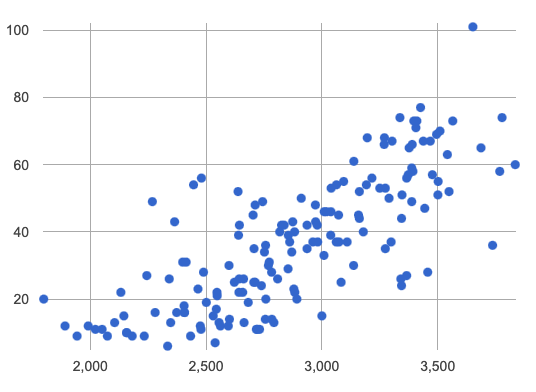
Here’s an example of a scatter plot.

-
Do you see the point cloud? How would you describe it?
-
We could describe this point cloud as sloping upward diagonally from the bottom left to the top right.
-
We could imagine the points clustering around a diagonal line with a positive slope.
Before we turn to Pyret, let’s learn how to make a scatter plot by hand.
-
Turn to Creating a Scatter Plot.
-
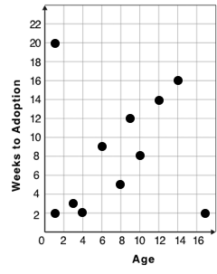
Use each row in the dataset to make a point on the scatter plot with
agefor x andweeksfor y.

-
What pattern do you see in the scatter plot you made?
-
The point cloud seems to be sloping diagonally up and to the right.
-
In general, older animals seem to take longer to be adopted.
-
Are there any points that seem unusual? Why?
-
The lizard named Diver at (1,20) and the dog named Bob at (17,2) both fall pretty far from the other points.
Unusual observations in a scatter plot are more complicated than outliers in a histogram or box plot, because it’s the combination of x and y values that makes them stand apart from the rest of the cloud.
-
Suppose we plotted the age and adoption time of four random animals, and found that they all fell in a line. Is this enough to determine that there’s a relationship between the variables?
-
No! Just as four flips of a fair coin might come up tails, four points chosen from a scatter plot with no pattern might still fall on a line! As our sample size increases, the chance of us seeing a pattern by random chance gets smaller and smaller.
Synthesize
-
How do patterns or trends show up in a scatter plot?
-
As point clouds
🔗Scatter Plots in Pyret
Overview
Students use Pyret to apply what they’ve learned about scatter plots to the Data Cycle, using it to answer questions about relationships in the animals dataset.
Launch
Let’s see how the tiny sample you plotted by hand compares to the data in the animals table we’ve been working with.
When you created the scatter plot by hand, you started with a Table. Then you plotted a series of dots, using one column for your x’s, one column for your y’s, and the name column to provide a label for each dot.
Pyret has a scatter-plot function that works exactly the same way: it starts with a table, and then needs to know which columns to use for labels , x-coordinates (xs), and y-coordinates (ys). Here’s the Contract:
|
-
Open your saved Animals Starter File, or make a new copy.
-
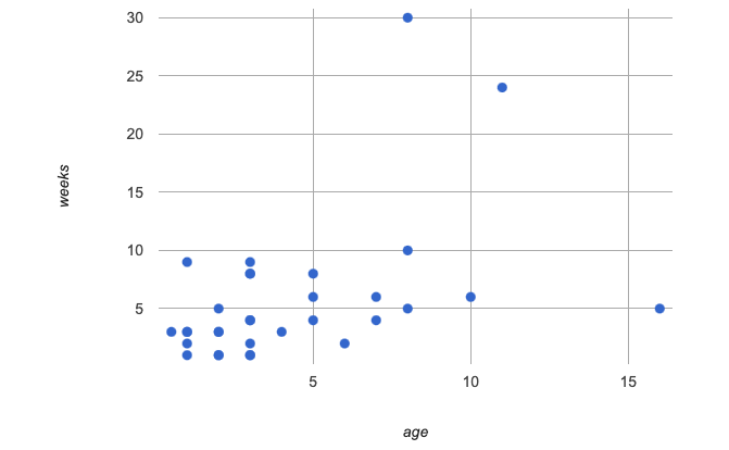
Make a scatter plot that displays the relationship between
ageand adoption time (weeks).
To do this, students will need to type in: scatter-plot(animals-table,"name", "age", "weeks")

-
Are there any patterns or trends that you see here? How do they compare to the scatter plot you made by hand?
-
Most of the animals that are less than 5 years old are adopted in 5 weeks or less. More of the older animals take longer to be adopted. So I’d say that adoption time tends to increase with age, but the relationship isn’t nearly as strong as it was in the smaller sample.
What about Line Graphs?
Line graphs and scatter plots have a lot in common! They both visualize the relationship between two columns, and both columns must be quantitative.
There is an important difference, however, in that line graphs are used when change is continuous. Only in this situation can it be appropriate to "connect the dots", because they represent the rise and fall of a measure over time. For example, if we know that the temperature was 80 degrees at 5pm and 70 degrees at 7pm, we can be sure that it was 73 degrees somewhere in between there. In contrast, if we made a plot about the worth of nickels, we’d have a point connecting 3 nickels and 15 cents and another connecting 5 nickels and 25 cents, but it would not make sense to declare the worth of 3.5 nickels (since it’s not possible to have half a nickle… unless you broke the law and sawed one in half, in which case it wouldn’t be worth anything.)
For students who want to use line graphs, the Contract is:
# line-graph :: (Tabletable-name, Stringlabels, Stringxs, Stringys) -> Image
Investigate
-
Do you think age is the only factor that determines how long it takes for an animal to get adopted?
-
The goal here is to have an open discussion and draw students in. Allow students to share their opinions freely. For example:
-
No! People like animals that are cute and friendly.
-
Some dog breeds are probably more popular than others.
-
Animals that are healthy might get adopted faster.
-
Many apartment buildings do not allow large breeds of dogs, and have a limit on how heavy a resident’s dog can be.
Perhaps the weight of an animal influences the adoption time!
-
Take a look at the Animals Dataset on the spreadsheet or on this page (for those using a printed workbook, you’ll find it at the back) and consider whether there’s any evidence of a relationship between
poundsandweeks. -
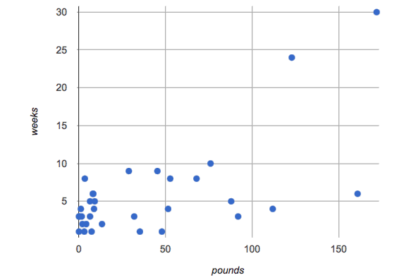
Then complete the first Data Cycle on Data Cycle: Looking for Relationships (Animals), making a scatter plot to get a better visual sense of a possible relationship between
poundsandweeks.

-
What did you find when you looked at the scatter-plot?
-
The animals weights ranged up to 172 pounds, but most of them weighed less than 10 pounds. Similarly, some animals took up to 30 weeks to be adopted, but most seemed to be adopted in under 10 weeks.
-
Does there appear to be a pattern or trend?
-
There might be a slight trend toward heavier animals taking longer to adopt, but the bigger story seems to be that most of the animals weigh under 10 pounds and are adopted in under 10 weeks.
-
What might be problematic about including every species in the same scatter plot of weight?
-
Some animal species are much smaller than others! So it could turn out that the differences in adoption times by weight are actually differences in adoption times by species.
-
What follow-up questions do you have?
Choose a follow-up question to add to the second Data Cycle on Data Cycle: Looking for Relationships (Animals), and complete the Data Cycle for your new question.
-
What did you learn through your Data Cycle?
-
What new questions did it lead you to ask?
Synthesize
-
What is special about scatter plots?
-
They let us see relationships between two columns! Most of the other data visualizations available us only support reasoning about a single columns of data.
🔗Visualizing Trends
Overview
Students practice picturing relationships between two columns of data in their minds eye and then look for trends in Pyret scatter plots. We’re building towards the idea of linear associations, which is the focus of our lesson on Correlations.
Launch
-
Imagine a scatter plot of height v. age for K-12 students. What would you expect it to look like, and why?
-
Because children grow taller from age 5 to 18, we would expect to see a point cloud sloping upward to the right, with younger students tending to be shorter, and older students tending to be taller.
-
Imagine a scatter plot comparing the number of Marvel movies produced each year to the number of car accidents each year. What would you expect it to look like?
-
There is no relationship between Marvel movies and car accidents, so we wouldn’t expect the points to be clustered in any particular way.
Investigate
Let’s get some more practice with building scatter plots in Pyret and looking for trends.
-
Turn to Exploring Relationships Between Columns. With your partner discuss what you expect the relationship for each pair of variables to look like.
-
Then build the relevant plots in Pyret to complete the page.
Debrief, showing the plots on the board. Make sure students also see the plots for which there is no relationship!
When does it make sense to look for a relationship between two columns?
We have seen that scatter plots give us the power to explore relationships between two columns of data. But, it is important to note that sometimes comparing two full columns of data doesn’t actually make sense!
For example, different species have very different lifespans!
A 5-year-old tarantula is still really young, while a 5-year-old rabbit is fully grown.
With differences like this, plotting weeks to adoption and age for all of the species with identical blue dots on the same scatter plot could:
-
hide a real relationship
-
create the illusion of a relationship that isn’t really there!
-
For what other variables in the Animals Dataset might it make more sense to zoom in on species-level data when looking for relationships between columns? Why?
-
Animal weights also vary widely by species — a snail is a lot lighter than a dog!
Pyret is not limited to basic scatter plots! There are ways to define functions of your own and extend Pyret to deepen your analysis. Our lesson on Advanced Data Visualizations supports students in creating more useful and engaging charts that allow them to dig further into their data.
Synthesize
-
What kinds of relationships have we seen in scatter plots?
-
linear, strong, weak, no relationship
-
When doesn’t it make sense to compare all of the data in two columns using a scatter plot?
-
When there is a lot of variability in a column of data between subsets.
🔗Data Exploration Project (Scatter Plots)
Overview
Students apply what they have learned about scatter plots to their chosen dataset. They will add two items to their Data Exploration Project Slide Template: (1) at least two scatter plots and (2) any interesting questions that emerge.
Visit Project: Dataset Exploration to learn more about the sequence and scope. Teachers with time and interest can build on the exploration by inviting students to take a deep dive into the questions they develop with our Project: Research Capstone.
Launch
Let’s review what we have learned about making and interpreting scatter plots.
-
Does a scatter plot display categorical or quantitative data? How many columns of data does a scatter plot display?
-
Scatter plots display two columns of quantitative data and a third column of quantitative or categorical data is used to label the points.
-
What do scatter plots show us about a dataset?
-
Scatter plots allow us to look for relationships between two columns of dataset.
Investigate
Let’s connect what we know about scatter plots to your chosen dataset.
Students have the opportunity to choose a dataset that interests them from our List of Datasets in the Choosing Your Dataset lesson.
-
Open your chosen dataset starter file in Pyret.
-
Choose two quantitative columns from your dataset whose relationship you want to explore, and another column that makes sense to use as labels for your points.
-
Create a scatter plot.
-
What question does your display answer?
-
Possible response: What is the relationship between column A and column B of my dataset?
-
Write down that question in the top section of Data Cycle: Looking for Relationships (My Dataset).
-
Complete the rest of the data cycle, recording how you considered, analyzed and interpreted the question.
-
Repeat this process for at least one other pair of quantitative columns.
Confirm that all students have created and understand how to interpret their scatter plots. Once you are confident that all students have made adequate progress, invite them to access their Data Exploration Project Slide Template from Google Drive.
It’s time to add to your Data Exploration Project Slide Template.
-
Copy/paste at least two scatter plots.
-
Be sure to also add any interesting questions that you developed while making and thinking about your scatter plots.
You may need to help students locate the “Scatter Plot” slide in the "Making Data Visualizations" section. They will need to duplicate the slide to add their second display. The “My Questions” section is at the end of the slide deck.
Synthesize
Have students share their findings.
-
Were the relationships you investigated stronger or weaker than you expected?
-
What questions did the scatter plots raise about your dataset?
-
What, if any, unusual observations did you discover when making scatter plots?
-
Were there any surprises when you compared your findings with other students? (For instance: Did everyone find unusual observations? Was there more or less similarity than expected?)
These materials were developed partly through support of the National Science Foundation, (awards 1042210, 1535276, 1648684, 1738598, 2031479, and 1501927).  Bootstrap by the Bootstrap Community is licensed under a Creative Commons 4.0 Unported License. This license does not grant permission to run training or professional development. Offering training or professional development with materials substantially derived from Bootstrap must be approved in writing by a Bootstrap Director. Permissions beyond the scope of this license, such as to run training, may be available by contacting contact@BootstrapWorld.org.
