(Using another tool? Please select it now: Pyret.)
Students practice reading and describing histograms, using new vocabulary to describe histogram shape.
Lesson Goals |
Students will be able to…
|
Student-facing Lesson Goals |
|
Materials |
|
Preparation |
|
🔗Describing Shape
Overview
This activity focuses on describing shape from a histogram. Students explore shape by considering symmetry, peaks, clusters, and skew.
Launch
When we have a large dataset and we want a more collective overview of the data, histograms shine and dot plots become impractical. Histograms are valuable because they help us to see shape.
The Histograms Card Sort activity students are about to complete requires some teacher preparation. Make sure you’ve printed and cut out a set of cards for each pair of students before proceeding.
If that preparation is unrealistic for you, project the images for students to refer to as they work through this section and modify the directions accordingly. (Viewing all of the images at once, rather than as individual cards, requires a higher cognitive load for students, so we don’t recommend it.)
Your teacher will give you and your partner an envelope containing lettered histogram cards. Lay out the cards in front of you.
-
What do you Notice about the histograms?
-
What do you Wonder about the histograms?
Let’s sort some histograms!
-
With your partner, use the histogram cards to sort the cards into two piles: histograms that are roughly symmetrical, and histograms that are not roughly symmetrical.
-
Be prepared to share your groupings with the class.
If students are not familiar with the concept of "symmetry", spend some time briefly explaining that it exists when the right and left side of the data visualization are roughly mirror images. It’s important to emphasize that symmetry need not be exact for us to recognize its presence. In fact, data may have greater variability and skew than the histogram presents! (Think back to From Dot Plots to Histograms!)
Ensure that students agree on which histograms are symmetrical and which ones are not before proceeding with the activity. Note that cards A and L, for instance, are not precisely symmetrical — but we still (correctly) sorted them into our symmetrical group of displays.
Investigate
-
With your partner, use the histogram cards to complete Sorting Histograms.
-
We will pause for discussion after you complete the first section.
As you circulate, make note of the different groupings that students use; this will help with facilitation of class discussion and debrief. Encourage students to use appropriate vocabulary (i.e., peak, cluster, gap).
Let’s debrief.
-
How did you group your symmetrical histograms?
-
Responses will vary. Students may have grouped their histograms by the number of peaks, the number of gaps, or the location of the center. There are no wrong answers here.
-
How can you determine what’s typical of a symmetrical histogram?
-
With your partner, complete the second section of Sorting Histograms.
-
How did you group your asymmetrical histograms?
-
Possible groupings: no peaks, 1 peak, 2 peaks; 1 gap, no gaps; and center at X, center at Y.
-
How can you determine what’s typical of a symmetrical histogram?
-
The center of a symmetrical histogram is the line of symmetry. A common misconception is arguing that the center of the axis is the center of the histogram; students must also consider the range of the histogram.
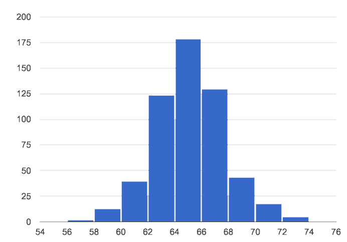
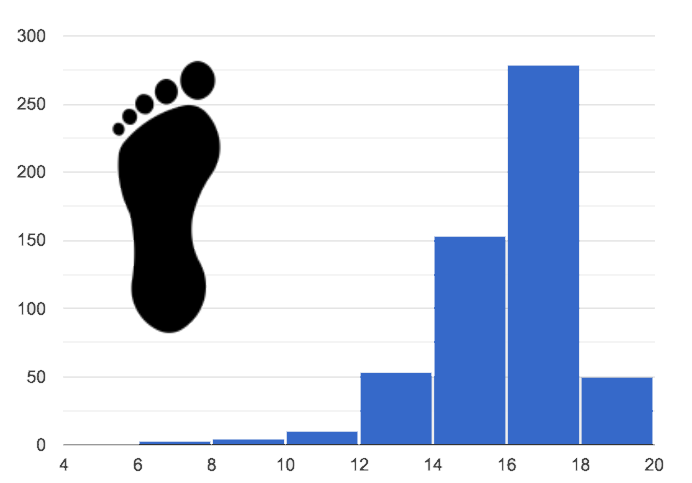
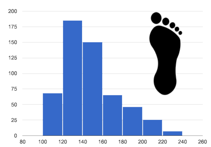
You probably noticed that some histograms trail off to the left, and others trail off to the right. Statisticians refer to this trailing as "skew". Let’s compare skew-left, skew-right, and symmetric histogram shapes.
| Symmetric | Skew-left | Skew-right |
|---|---|---|
|
|
|
Values are balanced on either side of the center. |
Values are clumped around what’s typical, but trail off to the left. |
Values are clumped around what’s typical, but trail off to the right. |
Skew-left distributions look like the toes on your left foot, and skew-right distributions look like the toes on your right foot!
Shape is useful because it enables us to quickly identify and describe trends in data. When we recognize a particular shape, we can immediately draw conclusions about a dataset! We’ll dig deeper into that idea in our lesson on Histograms: Interpreting "Shape".)
Shape is one of a few key features that sets histograms apart from bar charts!
Complete Bar Charts Versus Histograms.
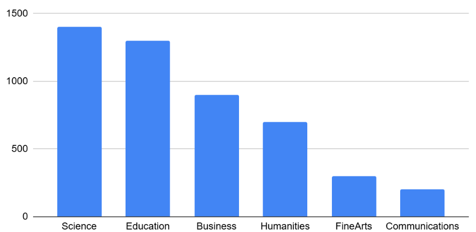
Bar Charts Versus Histograms surfaces two common student misconceptions about bar graphs that Whittaker and Jacobbe (2017)Douglas Whitaker, Tim Jacobbe (2017). Students' Understanding of Bar Graphs and Histograms: Results From the LOCUS Assessments. Journal of Statistics Education, 25(2), 90-102. cite in their research.

-
First, students commonly fail to understand that skew is associated with distributions of quantitative variables. This is why a bar graph with its bars arranged in increasing or decreasing order does not display a skewed distribution.
-
Students also commonly believe that the category with the greatest value represents a majority of the responses. In this dataset, that is not the case: the bar representing the college of science does not represent more than half of the students.
Because a bar chart displays categorical data, we can order the bars anyway that we wish. That is not the case with histograms: since quantitative data must follow a natural order, a histogram’s bars cannot be re-ordered.
-
What are some ways that bar charts and histograms are alike?
-
Both bar charts and histograms display frequency. Both displays have bars!
-
What are some ways that bar charts and histograms are different?
-
Bar charts display categorical data, while histograms display quantitative data. A histogram’s bars touch, and a bar chart’s bars do not. Histograms have shape, so their bars cannot be reordered. Bar chart bars can be reordered.
Synthesize
-
Envision a skew-left histogram. Where do you think its outliers are? Explain how you know.
-
A skew-left histogram trails off to the left. The histogram trails to the left because there are few data points (outliers) to the left, rather than many (causing tall bars).
-
Why do histograms have shape but bar charts do not?
-
Because histograms are quantitative, their bars must appear in numerical order. Bar charts show categorical data, meaning that the bars can be arranged in any way.
🔗Choosing the Right Bin Size
Overview
Students learn to make histograms from the animals-dataset in CODAP and explore the importance of choosing the right bin size in order for a histogram to show us the shape of the data.
Launch
-
What is a bin on a histogram? And what do we already know about them?
-
The goal here is to hear what students have internalized so far. This is not the moment to teach about bins as we are about to delve into a deep exploration.
-
We would expect that students have some sense that bins are the intervals that data gets grouped into.
Bins that are too small will hide the shape of the data by breaking it into too many short bars. Bins that are too large will hide the shape by squeezing the data into just a few tall bars. So far, the bins were provided for you. But how do you choose a good bin-size?
Make sure you have created a link or code for your class to Exploring Bin Size (Desmos).
-
Open the Desmos link I’ve shared with you. (The file should be called Histogram Bin Size Exploration.)
-
Use the Bin Size slider to explore how changing the bin size impacts the shape of the histogram and what we can learn about the distribution of the data.
-
Record your notices and wonders in the space provided on Slide 1.
-
Before moving on to Slide 2, be sure to click the "New Dataset" button and see if you notice and wonder anything new.
-
When you’re done exploring Slide 1, move on to Slide 2 and answer the questions.
Investigate
Suppose we want to know how long it takes for animals from the shelter to be adopted.
-
Log into CODAP, open your saved Animals Starter File (or make a new copy), and click "Run".
-
Complete Choosing the Right Bin Size.
-
What did you Notice?
-
We see most of the histogram’s area under the two bars between 0 and 10 weeks, so we can say it was most common for an animal to be adopted in 10 weeks or less.
-
We see a small amount of the histogram’s area trailing out to unusually high values, so we can say that a couple of animals took an unusually long time to be adopted: one took even more than 30 weeks.
-
More than half of the animals (17 out of 31) took just 5 weeks or less to be adopted. But the few unusually long adoption times pulled the average up to 5.8 weeks.
-
What was a typical adoption time?
-
Almost all of the animals were adopted in 10 weeks or less, but a couple of animals took an unusually long time to be adopted — even more than 20 or 30 weeks!
-
Be sure to draw attention to the fact that it would have been hard to give this summary by reading through the table, but the histogram makes it easy to see!
-
What bin sizes worked best for analyzing
adoption? -
Have students talk about the bin sizes they tried. Encourage open discussion as much as possible here, so that students can make their own meaning about bin sizes before moving on to the next point.
Rule of thumb: a histogram should have between 5–10 bins.
Histograms are a powerful way to display a dataset and assess its shape. Choosing the right bin size for a column has a lot to do with how data is distributed between the smallest and largest values in that column! With the right bin size, we can see the shape of a quantitative column.
But how do we talk about or describe that shape, and what does the shape actually tell us?
Our Histograms: Interpreting "Shape" lesson addresses these questions and explores how histogram shape affects the mean (average).
Synthesize
-
What would the histogram look like if most of the animals took more than 20 weeks to be adopted, but a couple of them were adopted in fewer than 5 weeks?
-
The histogram would be skewed left, with a peak on the right.
-
What would the histogram look like if every animal was adopted in roughly the same length of time?
-
All of the animals would be stacked into one very tall bar.
🔗Additional Practice
These materials were developed partly through support of the National Science Foundation, (awards 1042210, 1535276, 1648684, 1738598, 2031479, and 1501927).  Bootstrap by the Bootstrap Community is licensed under a Creative Commons 4.0 Unported License. This license does not grant permission to run training or professional development. Offering training or professional development with materials substantially derived from Bootstrap must be approved in writing by a Bootstrap Director. Permissions beyond the scope of this license, such as to run training, may be available by contacting contact@BootstrapWorld.org.


