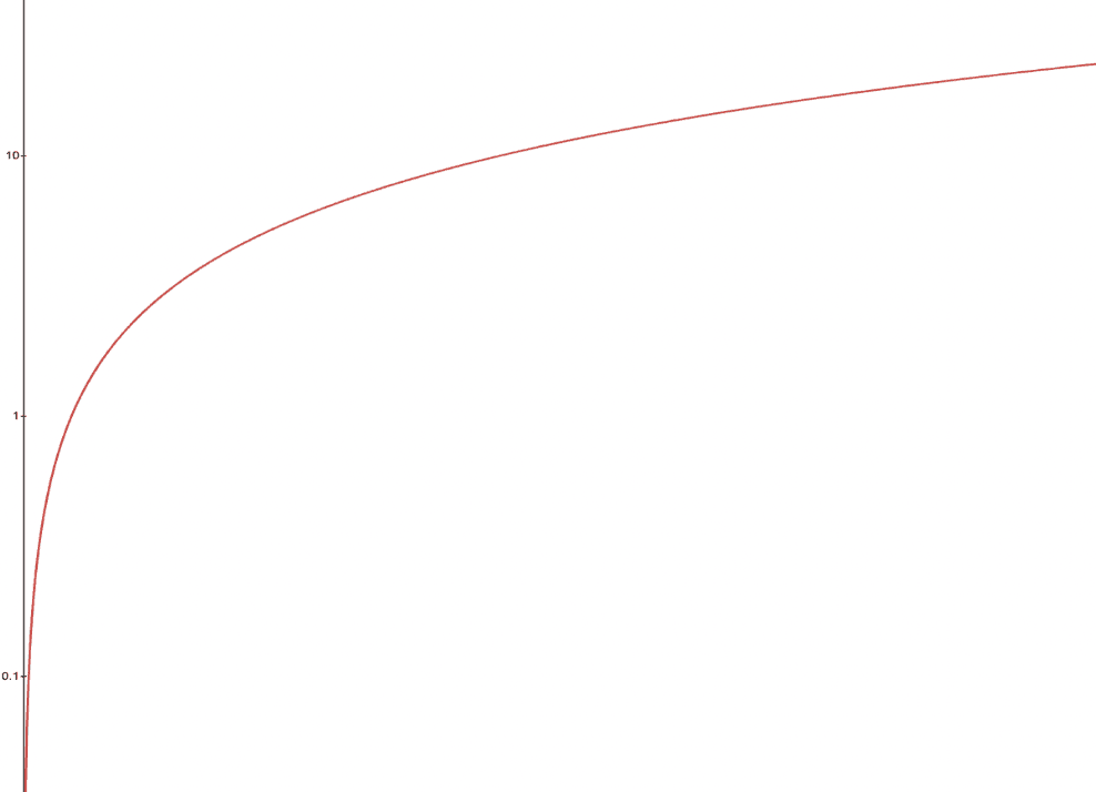
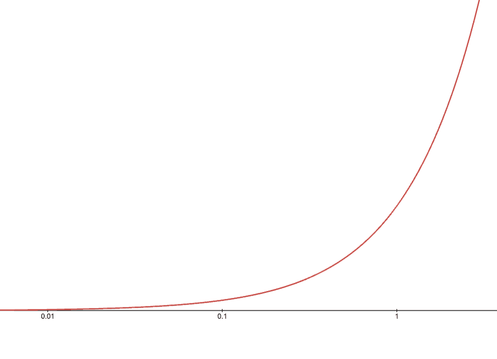
Students explore changing the scale on the axes from linear (intervals are consistent) to logarithmic (each interval is exponentially larger than the last).
Lesson Goals |
Students will be able to…
|
Student-facing Lesson Goals |
|
Materials |
|
Preparation |
|
🔗Balancing Growth: Functions and Axes
Overview
Students deepen their understanding of functions as a "ratio of growth", by experimenting with Desmos’s Linear and Logarithmic settings for x- and y-axes. These settings change the way the axis intervals grow, resulting in inverse behavior in the graph. The logarithmic setting results in exponentially-increasing intervals, which warp the graph of functions in interesting ways! Students explore these changes on a variety of functions.
Launch
You’ve probably heard people talk about the slope of a line as "rise over run", or "rate of change". Both of these terms have to do with comparing one variable to another. On a graph where one variable is on the y-axis and the other is on the x-axis, that means comparing the growth in one axis to growth in another.
In a linear function, the growth of the function is proportional to the growth of the input. For example, in the line f(x) = x, the growth of f(x) is exactly the same as the growth of x.
-
What is the slope of the function f(x) = x?
-
The slope is 1.
-
If the growth of f(x) is twice the growth of x, what is the slope of that line?
-
The slope is 2.
-
If the growth of f(x) is one-third the growth of x, what is the slope of that line?
-
The slope is 1 /3.
Proportional growth is linear growth.
 When we think about quadratic, exponential, or logarithmic growth, that just means that the variable graphed on the y-axis is growing more than just proportionally — it’s growing "quadratically", "exponentially", "logarithmically", etc. That’s what makes all these different-shaped curves!
You’ve graphed all of these lines and curves on axes that grow linearly: the tick marks along the x- and y-axis always grow in equal intervals.
But…who says the axes have to grow linearly?
Sync or pace students to Slide 5: Balancing Growth (Linear) of Fitting Wealth-v-Health and Exploring Logarithmic Models (Desmos).
-
Return to the Fitting Wealth-v-Health and Exploring Logarithmic Models Desmos file.
-
You should now be on Slide 5: Balancing Growth (Linear).
-
Use it to complete the first two sections of Balancing Function Growth and Axis Growth (Linear).
Investigate
 When we changed the scale of the y-axis from
 Linear to Logarithmic, our y-intervals went from growing linearly to growing exponentially: each interval on the y-axis represents 10x the length of the interval before it.
Our x-intervals are still growing linearly, so this has the effect of grabbing the top and bottom sides of the graph and "squishing" it. For our function to appear to increase by one inch on the y-axis, it actually needs to increase 10x as much as the inch before it!
With the y-axis appearing to grow more slowly than the x, we perceive our linear function "bending" up and looking exponential!
-
Reset both axes back to linear!
-
Complete the rest of Balancing Function Growth and Axis Growth (Linear)
When we changed the scale of the x-axis from Linear to Logarithmic, our x-intervals went from growing linearly to growing exponentially.
Our y-intervals are still growing linearly, so this has the effect of grabbing the left and right sides of the graph and "squishing" it. For our function to appear to increase by one inch on the x-axis, it actually needs to increase 10x as much as the inch before it!

-
Why did changing the x-axis to
Logarithmicmake our linear curve look exponential? -
With the x-axis appearing to grow more slowly than the y, our linear function "bends" up and looks exponential!
The key here is to think in terms of relative growth: the scale of one axis relative to the other balances out the growth of f(x) relative to x.
-
Why did changing both axes to
Logarithmicmake the line look normal again? -
Since both axes were growing proportionally to each other (linearly!), the growth on each axis is balanced and we can see the original shape of the line.
-
What do you think these transformations would to do to a logarithmic function? An exponential function?
-
Solicit some answers
Sync or pace students to Slide 6: Balancing Growth (Logs and Exponents) of Fitting Wealth-v-Health and Exploring Logarithmic Models (Desmos).
-
Turn to Balancing Function Growth and Axis Growth (Logs and Exponents), and complete the first section.
-
Why did changing the x-axis to
Logarithmicmake our logarithmic curve look linear? -
We squished the x-axis, but kept the y-axis linear. Since the y-intervals were growing exponentially relative to the x-intervals, that growth canceled out the logarithmic growth of g.
-
Why did changing the y-axis to
Logarithmicmake our logarithmic curve look sharper? -
Instead of canceling out the logarithmic growth of the function, we took the "log of the log" — making the effect even sharper.
Synthesize
The last question on Balancing Function Growth and Axis Growth (Logs and Exponents) asks us how we might make the function h appear linear, by re-scaling only the x-axis.
-
Desmos gives us two choices for how our intervals grow on the x-axis. What are they?
-
Linear (each interval is the same size as the last)
-
Logarithmic (each interval is 10x larger than the last)
-
If we wanted to make our exponential function h appear linear, how would we want the intervals on the x-axis to grow?
-
We would need it to "undo" or "cancel out" the logarithmic growth of g, so we want each interval on the x-axis to be 10x smaller than the one before it.
-
Desmos would probably call this "Exponential" scale
-
We made our logarithmic function g appear linear by changing the x-axis to
Logarithmic. If we wanted to use the y-axis instead, what kind of scale would it need to be? -
We would need it to "undo" or "cancel out" the exponential growth of h, so we want each interval on the y-axis to be 10x smaller than the one before it.
-
How might changing the scale help us find a better logarithm of best fit for our dataset?
-
It’s easier to eyeball a line of best fit than a log of best fit, and changing the scale will make the relationship looks linear
Desmos is a powerful tool for many things, but it also has many limitations. This is where a programming language comes in handy! We can write code that transforms the axes any way we want: exponentially, quadratically, etc.
But how does changing the scale help us fit a model?
🔗Changing the Scale to Fit a Model
Overview
Students take what they’ve learned about changing the scale, and apply it to their scatter plots of income v. lifespan.
Launch
Sync or pace students to Slide 7: Wealth-v-Health (Logarithmic) of Fitting Wealth-v-Health and Exploring Logarithmic Models (Desmos).
-
Let’s apply what we’ve learned about changing scale to our data!
-
In order to complete the first section of Fitting Logarithmic Models, you’ll need to:
-
Return to the Fitting Wealth-v-Health and Exploring Logarithmic Models Desmos file. You should now be on Slide 7: "Wealth-v-Health (Logarithmic)".
-
Open the Countries of the World Starter File.
-
-
What values did you come up with for a and k in your best-guess logarithmic model?
-
Record different students' responses for a and k on the board.
-
How do your a and k values compare with those of other students'? Are they very similar or very different?
-
What were the S values for these models?
Trial-and-error only gets us so far, and it’s not clear that we would ever stumble upon the optimal model. We need something like Pyret’s lr-plot, which uses computational methods to find the optimal model.
Data Scientists often use transformations to stretch their data into shapes that are easier to work with, and then reverse the transformation when they are done.
If only we could transform this data to make it appear linear… Then we could use lr-plot to fit the optimal model, and reverse the transformation to get the optimal logarithmic model!
Investigate
-
Complete the last section of Fitting Logarithmic Models.
-
Be ready to share your logarithmic model, and your answer to the last question!
Students will be switching the x-axis of their graph from linear to logarithmic in this section. Make sure they are toggling back and forth between the two views as they look for the best-fitting model.
It’s all about balancing rates of change…
-
A person running on a treadmill doesn’t change location. Why not?
-
Their forward movement is balanced by the backwards movement of the treadmill.
-
If they run faster and faster, what needs to happen to the treadmill to keep them in the same place?
-
The treadmill needs to go faster as well. As long as the treadmill speed increases at the same rate as the runner, they will balance one another’s growth.
-
How is the treadmill example comparable to what we’ve done with our x-axis transformation?
-
We are speeding up the growth intervals on the x-axis to "keep up with" the speed of growth in the data so that we can see the pattern better.
By transforming the x-axis to grow exponentially, we squashed the coordinate plane so that each interval on the x-axis represents 10x the growth in pc-gdp as the one before it. This balances out the logarithmic growth in median-lifespan, and warps our logarithmic model so that the curve looks like linear.
-
How did changing the scale impact the quality of your model? Were you able to get a better S-value with the
logarithmic2model you made on the logarithmic scale than with thelogarithmicmodel you made on the linear scale? -
Answers will vary.
Undoing a Log by taking the…Log?
Relationships in our scatter plot represent a ratio of growth between two quantities. Consider a simple ratio like 1:3. This means the first quantity grows by one third with respect to the other. It can by turned into 1:1 in two ways:
-
Transform the first quantity (multiply by 3)
-
Transform the second quantity (divide by 3)
In our scatter plot, the ratio is the growth in median-lifespan v. the growth in pc-gdp. The growth of one is logarithmic with respect to the growth of the other. This means there are two ways to linearize the data:
-
Transform the x-axis to match the y (take the log)
-
Transform the y-axis to match the x (raise to an exponent)
We’ve chosen the first option because Desmos doesn’t offer an exponential transformation of the axes. This property is impossible to explore given this limitation, but students will learn how to use Pyret transform any axis by any function in next lesson.
Synthesize
-
How does seeing the point cloud as linear help us think about logarithmic growth?
-
It’s more straight forward to try to visually fit a line than it is to visually fit a curve.
-
Transforming the axes only makes things look linear — the actual points haven’t changed at all, and we still can’t use linear regression to find the best logarithmic model… Can you think of a way we could transform the data, instead of the axes?
-
Give students a chance to share their ideas, but no need to answer the question. That’s what Linearizing Logarithmic Data is all about!
Linear regression allows us to find the computationally optimal model, not just a model that "fit really well."
-
In this project, do we know whether or not our model is the best?
-
We do know!
-
How do you know?
-
By linearizing the data and applying linear regression, we were able to find the optimal model for the transformed dataset. When the transformation is reversed, the optimal linear model becomes the optimal logarithmic one.
These materials were developed partly through support of the National Science Foundation, (awards 1042210, 1535276, 1648684, 1738598, 2031479, and 1501927).  Bootstrap by the Bootstrap Community is licensed under a Creative Commons 4.0 Unported License. This license does not grant permission to run training or professional development. Offering training or professional development with materials substantially derived from Bootstrap must be approved in writing by a Bootstrap Director. Permissions beyond the scope of this license, such as to run training, may be available by contacting contact@BootstrapWorld.org.
