Students investigate quadratic relationships in Major League Baseball data from Aaron Judge’s hits in 2016 and 2017.
Lesson Goals |
Students will be able to…
|
Student-facing Lesson Goals |
|
Materials |
|
Supplemental Materials |
|
🔗Exploring the Data
Overview
Students explore the Aaron Judge Starter File, and create scatter plots to search for relationships between columns. They share and discuss their findings with the class, discovering the limitations of linear models.
Launch
These questions are intended to spark student interest in the dataset they are about to explore.
 Aaron Judge is an American professional baseball outfielder for the New York Yankees. In 2022 he hit 62 home runs, setting the American League record for most home runs in a season.
-
What is a home run?
-
When a batter makes it around all of the bases and back to home plate before the other team is able to gain control of the ball and stop them.
-
What factors might influence how many home runs a player hits in a season?
-
Possible responses:
-
How fast the batter runs.
-
How strong the batter is.
-
The speed and angle at which the batter swings the bat.
-
How calm and focused the player is when they are at bat, perhaps influenced by personality, sleep, diet, stretching, meditation, etc.
-
How many hits make it into the bleachers, so they are inaccessible to the outfielders.
-
How fans and teammates support the batter.
-
How big the fields are where the practice and play — in some stadiums (like Boston’s Fenway Park) a hit of 302 feet will make it past the outfield. Some stadiums have distances exceeding 400 feet to center field.
In this lesson, we’ll explore possible relationships between pitch (type and speed), bat angle, and hit (distance, speed and ball type) in a dataset of Aaron Judge’s hits in 2016 and 2017.
-
Open the Aaron Judge Starter File.
-
From the File menu, select "Save a Copy", and click "Run".
-
Working in pairs or small groups, complete Exploring the Aaron Judge Dataset.
-
Which quantitative columns appear to have the strongest relationship?
-
bat-angle and hit-distance
-
Would you describe the relationship as linear? Why?
-
No. Because it’s u-shaped, rather than a straight line.
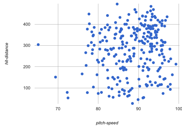 pitch-speed v hit-distance
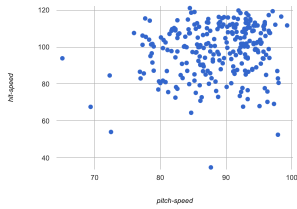 pitch-speed v hit-speed
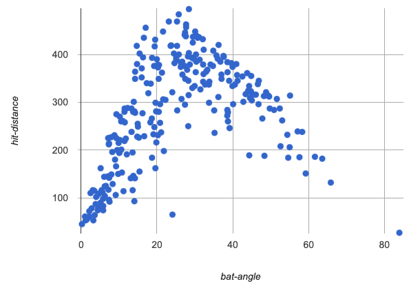 bat-angle v hit-distance
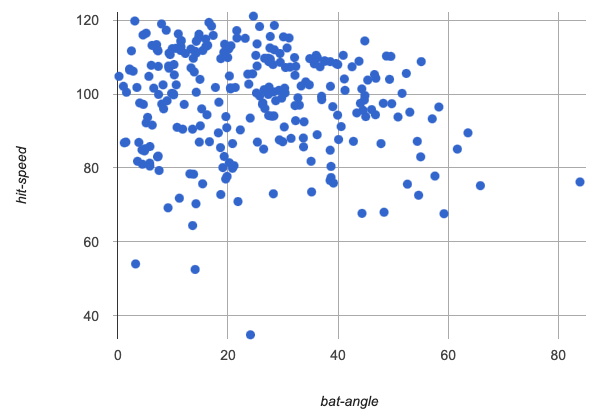 bat-angle v hit-speed
-
What is happening on lines 21-36 of the Definitions Area?
-
Four filtered tables are being defined, focused on subsets of the data for specific hit types
-
How would we make a scatter plot comparing
bat-angleandhit-distancefor just the curve balls? -
Exactly like the scatter plots we just made, except we’d use
curve-tableinstead ofjudge-table -
scatter-plot(curve-table, "id", "bat-angle", "hist-distance") -
Take a moment to make scatter plots comparing
bat-angleandhit-distancefor each of the filtered tables defined in the starter file. How do they compare? -
They all more or less make an upside down U shape, but they look slightly different and have a different numbers of points.
Investigate
Let’s focus on just the curve balls for now. There definitely appears to be a relationship here…
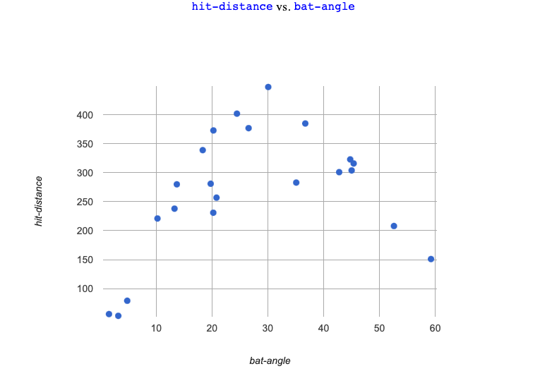
-
Complete the first section to find the optimal linear model and see how well it predicts hit distances from bat angles.
-
Is the best-possible linear model a good fit? Why or why not?
-
No. The model does not follow the shape of the data!
-
Use the S-value to describe the fit of the model.
-
The S-value predicts an error of almost 104 feet for hit distances that only range between 50 and 400 feet!
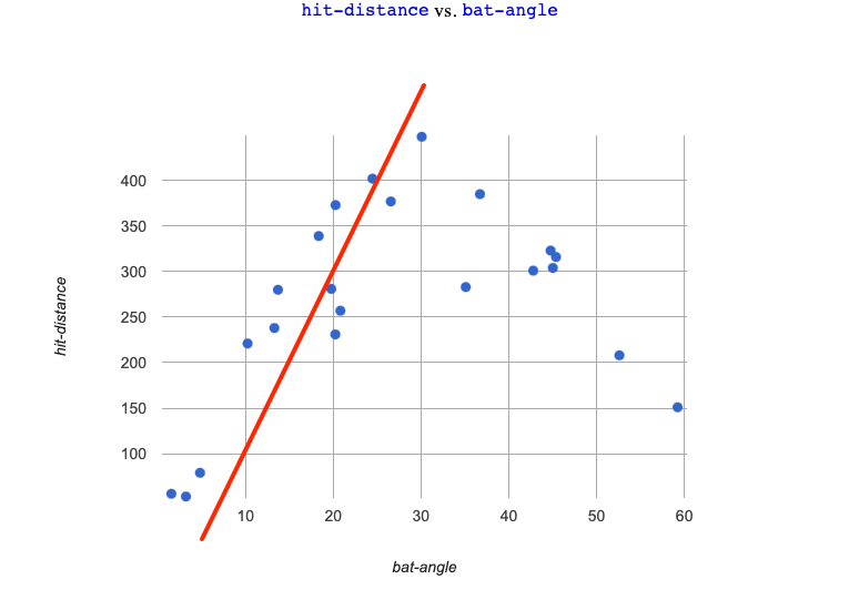
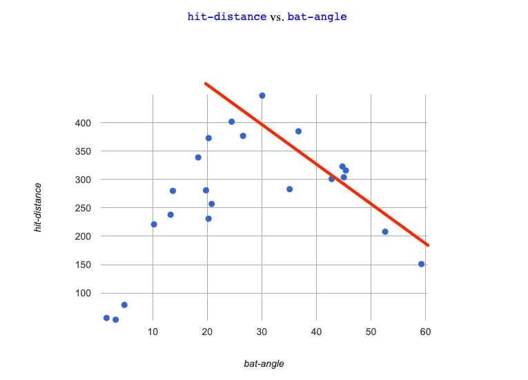
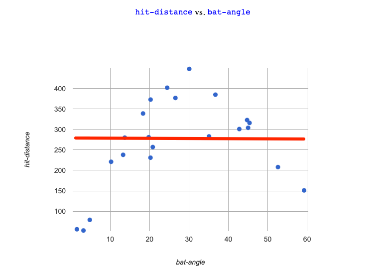
Linear models don’t seem to fit very well! No matter which direction we draw the line, many of the points are far away — and they will make poor predictions for a large subset of x-values.
When we build a linear model to fit the increasing half of the data, it doesn’t do the decreasing half justice… |
When we build a linear model to fit the decreasing half of the data, it doesn’t do the decreasing half justice… |
And trying to split the difference, is even worse… |
|
|
|
-
Turn to the Fitting Curves section of What Shape of model would Fit the Data?.
-
Drawing and describe the pattern you actually see. Then use it to make some predictions.
-
Discuss your thinking with your partner.
-
How would you describe the pattern you see here?
-
Aaron Judge’s hit distance generally increases as his bat angle increases from 0 to 30 degrees. As the angle increases after that, his hit distance generally decreases!
Review student answers to confirm that students see a nonlinear relationship in the dataset that is fairly strong. Students should generally agree that the relationship is better fit by a curve, with hit distance peaking at a bat angle of roughly 30 degrees. Make sure students have agreed on this vertex, as its location is important for the next activity!
Have students share their "curves of best fit", encouraging them to identify where they "peak" and where they cross the x-axis. These locations will be important anchor concepts on which to build in the next section. (One option for facilitating sharing is to project the scatter plot on a whiteboard and have students come up and draw all of their curves on it).
Synthesize
-
Why don’t linear models work to model the relationship between bat angle and hit distance?
-
What kinds of curves did you draw that fit better?
🔗Quadratic Relationships
Overview
Students are introduced to quadratic functions. They become familiar with scenarios involving quadratics learn how to identify quadratic sequences.
Launch
Linear models work well for fitting simple relationships, but many relationships in the real world are far more complex!
Straight-line, linear models are often too primitive.
The relationship we observe between bat angle and hit distance appears to best be described by a curve, where hit distance increases up to a certain bat angle, and then decreases again. This is definitely not linear! There are many kinds of non-linear relationships. The first one we’ll learn about is called a quadratic relationship.
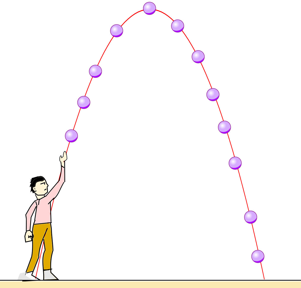
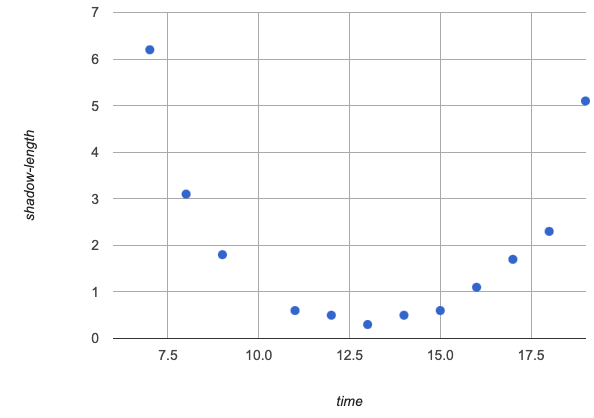
Graphs of quadratic relationships are often described as "u-shaped" or "looking like an arch". More formally, mathematicians and data scientists call these kinds of curves parabolas. There are lots of relationships that change direction like this!
| Some quadratic curves Peak | Other quadratic curves Bottom Out |
|---|---|
A ball thrown in the air will rise quickly, slow down, peak, and then begin to fall. |
The length of a shadow is long in the morning, shortens as the sun rises, and lengthens as the sun sets. |
|
|
Investigate
Turn to What Kind of Model? (Descriptions) and practice identifying which scenarios are likely best modeled by linear relationships and which are likely best modeled by quadratic relationships.
-
What characteristics did you look for to identify whether a scenario was likely best-modeled by a linear or quadratic relationship?
-
When there’s either a steady increase or a steady decrease, a linear model will likely fit.
-
When there’s a high point or a low point at which the change changes direction, a quadratic model will likely be a good fit.
Synthesize
-
Brainstorm some other real-world relationships that could likely be modeled by a quadratic function.
-
Answers will vary.
-
Many nutrients are good for you, and the more you take the healthier you are…up to a point. After that, too much of a mineral or vitamin can cause problems. A graph of health(dose) will be quadratic.
-
When an athlete is young, they improve as they get stronger and more skilled. But as they age, they begin to lose their speed and strength.A graph of height(time) will be quadratic.
-
The temperature of a puddle will warm and then cool over the course of the day. A graph of temp(time) will be quadratic.
-
A ball dropped from a tall building will get faster and faster as it falls, so a graph of distance(time) will be quadratic.
🔗Additional Practice
-
The Exploring the Fuel Efficiency Dataset engages students in exploring the Fuel Efficiency Starter File.
-
Thinking for this page parallels What Shape of model would Fit the Data?
-
For students who aren’t baseball fans, a chance to practice what they’ve learned in another context may be welcome.
-
NOTE: While the fuel efficiency dataset used in the optional materials we’ll be offering throughout our quadratics lessons is based on real data obtained from the Transportation Energy Book, it has been augmented with fictional data in order to provide a sufficiently-rich dataset for student modeling. You can find out more about this augmentation in the README tab of the dataset.
These materials were developed partly through support of the National Science Foundation, (awards 1042210, 1535276, 1648684, 1738598, 2031479, and 1501927).  Bootstrap by the Bootstrap Community is licensed under a Creative Commons 4.0 Unported License. This license does not grant permission to run training or professional development. Offering training or professional development with materials substantially derived from Bootstrap must be approved in writing by a Bootstrap Director. Permissions beyond the scope of this license, such as to run training, may be available by contacting contact@BootstrapWorld.org.

