Students investigate how to combine the types of models they have already learned about.
Lesson Goals |
Students will be able to…
|
Student-facing Lesson Goals |
|
Materials |
|
Supplemental Materials |
|
🔗Deconstructing Models
Overview
Students explore the historical data, discovering that there’s a stronger pattern at work than seasonal periodicity: a seemingly-linear pattern of rising CO2 over time. After considering why we ended up with a periodic model initially and how it connects to the larger trend in the data, they practice comparing S-values for the different models they’ve fit.
Launch
-
Let’s consider two periodic models built from the
recent-tableusing cosine. -
Complete the first section of Choosing the Best Model for the Data, looking at functions defined in the Hybrid CO2 Models Starter File.
fun periodic-cos(x): (4.13 * cos(6.28 * (x - 2023.35))) + 419.87 end
fun wave-cos(x):     (4.13 * cos(6.28 * (x - 2023.35)))          end
fun midline-cos(x):                                       419.87 end
fun periodic-cos2(x): wave-cos(x) + midline-cos(x) end-
What is going on in
periodic-cos2and why does it produce the same graph asperiodic-cos? -
periodic-cos2is composed of two functions calledmidline-cosandwave-cos:-
midline-cosis just the vertical shift of theperiodic-cosfunction. -
wave-cosis all of the parts of theperiodic-cosfunction except for that vertical shift.
-
-
What kind of line passed between the peaks and waves of our
periodic-cosmodel? -
horizontal
-
How did that line get defined in our function definition?
-
Horizontal lines are defined by a single number — the vertical shift.
-
The final term of our
periodic-cosfunction definition is the number that defines the position of the horizontal line.
Our periodic-cos model has two terms:
-
The periodic term (4.13 × cos(2π(x − 2023.35))), which described the wave that wrapped around the horizontal midline
-
The vertical shift (419.87), which described the (fixed) y-coordinate of the midline
periodic-cos2 splits these terms into separate functions, and then composes them:
(+ (* 4.13 (cos (* (* 2 PI) (- x 2023.1)))) 419.87)
|
→ |
(+ (wave-cos x) (midline-cos x))
|
-
Let’s take a moment to refresh ourselves on the models we’ve seen so far and what their key characteristics are.
-
Complete the rest of Choosing the Best Model for the Data with your partner.
-
Of the models you sketched and described, which makes the most sense to try fitting to this scatter plot? Why?
-
Linear, because the point cloud is rising steadily.
-
Any other Notices or Wonders you would like to share?
Investigate
We built our periodic-sin model using data from a small window: just one year. The scatter plot we just looked at on Choosing the Best Model for the Data was also generated from CO2 data and had a very different shape!
-
Open the Hybrid CO2 Models Starter File and click "Run".
-
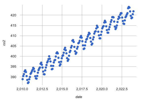
Make a scatter plot of CO2 over time for the
modern-table, which includes historical CO2 levels from 2010 to 2023. -
What do you Notice? What do you Wonder?

-
Why might somebody describe the shape of this data as linear?
-
Because we could draw a diagonal line with a positive slope through the middle of the wave and it would do a pretty good job of summarizing the trend.
-
Why might somebody describe the shape of this data as periodic?
-
Because there is a consistent wave that goes up and down in regular intervals.
-
In the Hybrid CO2 Models Starter File, find the code where you’re asked to "Define your periodic-sin functions…"
-
Define
periodic-sinto be the model you found using Desmos (which you already defined in Carbon Dioxide Starter File and on Modeling Recent Carbon Dioxide Levels (continued)). -
Define the wave and midline of your
periodic-sinmodel as separate functions, and recombine them inperiodic-sin2using function composition (you can refer to the example ofperiodic-cosineabove).
-
-
Test out your rewritten
periodic-sin2model withrecent-tableto confirm that it still fits as well as the original model!-
If anything has changed, check your code carefully!
-
-
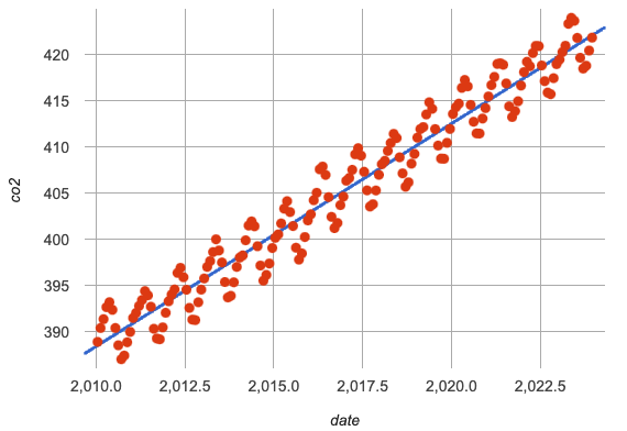
Work with your partner to fit linear and periodic models to the
modern-table. This CO2 data is from 2010 to 2023.
| Optimal Linear Model | Our Periodic Model |
|---|---|
|
|
-
How would you describe how the
linear-modernmodel fit ourmodern-tabledata? -
The linear regression plot shows the line of best fit passing through the middle of the diagonal wave of points.
-
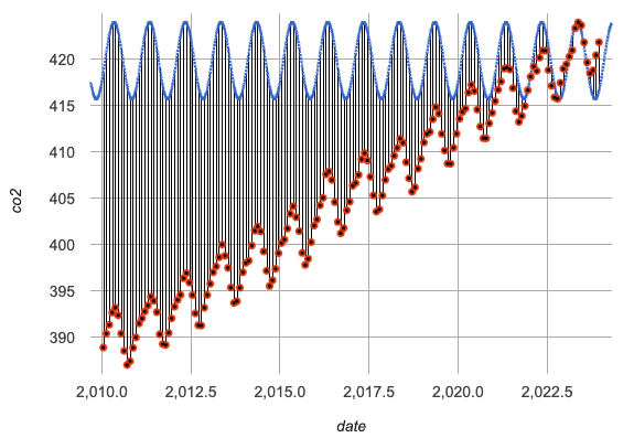
How would you describe how our
periodic-sinmodel fits the shape of the data from themodern-table? -
Answers will vary. Make sure discussion addresses residuals. Sample responses may include:
-
While they both have a wave, they look pretty different!
-
The model undulates around a horizontal line and the data undulates around a diagonal line.
-
The y-intercepts are in completely different places.
-
When we fit the
periodic-sinmodel to the data we see the model as a horizontal wave at the top, eventually lining up with the points on the right hand side of the graph. -
We also see vertical residuals showing the distance between each data point and the model.
-
-
Where does the
periodic-sinmodel fit themodern-tabledata best? -
Within the range of the dataset that it was built on.
-
Where does the
periodic-sinmodel fit themodern-tabledata worst? -
The farther we get from the date range it was built on.
-
How would you describe the shape of the model you drew that would be optimal?
-
Hopefully students will describe a wave whose midline is diagonal.
Synthesize
-
We built the
periodic-sinmodel to fit the data in therecent-table. Why doesn’t it do a good job of predicting CO2 levels for a larger time frame? -
Models are only reliable within the span of the data from which they were created. The fact that the model fit
recent-tablewell means it’s a good model for the data in that year, but we can’t make any assumptions about dates outside of the range of the training data.
🔗Hybrid Models
Overview
Students explore the possibility that a model could combine various kinds of models and use function composition to define functions from other functions.
We’ve chosen to describe these models as hybrid in order to make it accessible to students, but this is not a mathematical term. If you’re looking to connect this lesson to related materials, polynomial functions and/or function addition are terms that might turn up relevant reading.
Launch
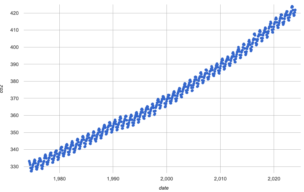
When we zoom out to see the historical CO2 data, we see that there are two different things going on:
-
The amount of CO2 in the air generally rises over time, for a positive, linear relationship with the year.
-
There are seasonal, periodic variations that cause CO2 to fluctuate up and down across that line.
The wave is following a diagonal line… so the midline for our model shouldn’t be horizontal at all!
-
Is it possible for a model to be both linear and periodic?
-
With your partner, complete Building a Hybrid Model.
-
What line should our model wrap around?
-
Our line of best fit!
-
What happens when you fit your
hybrid-modernmodel to themodern-tabledata? -
The model should now look like waves along a diagonal.
-
How much less error do we expect from predictions made with
hybrid-modernthan withlinear-modern? -
38%
By replacing the midline term (vertical shift) in our periodic model with the linear model from lr-plot, we get the best of both worlds:
-
Linear behavior for the midline representing the long-term trend…
-
Periodic behavior for the seasonal variation in CO2
f(x) = 4.13 × sin(2π(x − 2023.1)) + (1.8345x + −3296) |
(+ (wave-sin x) (linear-modern x))
|
We can visualize the body of the function using the Circles of Evaluation.
-
Now that you know how to build a hybrid model, let’s have you try building one on your own!
-
Turn to More Models and build a hybrid model for the full CO2 data.
Synthesize
-
Why did our hybrid model fit better than the periodic or linear models alone?
-
Because it captures both the overarching trend and the seasonal trend.
-
Why doesn’t it make sense to compare the following S-values?
-
the error we expect for predictions made from our
periodic-sinmodel with the data in themodern-table -
the error we expect for predictions made from our
periodic-sinmodel with the data in therecent-table
-
-
The datasets have completely different ranges!
Going Deeper
-
If students look carefully at the fit of their hybrid periodic model to the
co2-table, they’ll see that the model under-predicts at the beginning of the graph, then over-predicts in the middle, the under-predicts again at the end. Is it possible that there’s an even-better hybrid model, which mixes periodic growth with something other than linear? -
Have your students refer back to Exploring the Spread of Disease. As with the
recent-tabletable in Hybrid CO2 Models Starter File, the starter file there constrains the dataset to show only recent data. This is done for the same reason: to introduce students to a more perfectly-exponential model. Now that students know how to combine terms from different models, they can go back and build a model that fits the entire Covid dataset!
These materials were developed partly through support of the National Science Foundation, (awards 1042210, 1535276, 1648684, 1738598, 2031479, and 1501927).  Bootstrap by the Bootstrap Community is licensed under a Creative Commons 4.0 Unported License. This license does not grant permission to run training or professional development. Offering training or professional development with materials substantially derived from Bootstrap must be approved in writing by a Bootstrap Director. Permissions beyond the scope of this license, such as to run training, may be available by contacting contact@BootstrapWorld.org.


